Chapter 51
Using UnevenRoundedRectangle to Round Specific Corners
In SwiftUI, there is a convenient built-in modifier called cornerRadius that allows you to easily create rounded corners for a view. By applying the cornerRadius modifier to a Rectangle view, you can transform it into a rounded rectangle. The value you provide to the modifier determines the extent of the rounding effect.
Rectangle()
    .cornerRadius(10.0)
Alternatively, SwiftUI also provides a standard RoundedRectangle view for creating a rounded rectangle:
RoundedRectangle(cornerRadius: 25.0)
Unfortunately, both the cornerRadius modifier and the RoundedRectangle view can only apply the same corner radius to all corners of the shape.
What if you need to round a specific corner of a view?
In iOS 17, the SwiftUI framework introduces a new view called UnevenRoundedRectangle. What sets this view apart is the ability to specify a distinct radius value for each corner, allowing developers to create highly customizable shapes.
Working with UnevenRoundedRectangle
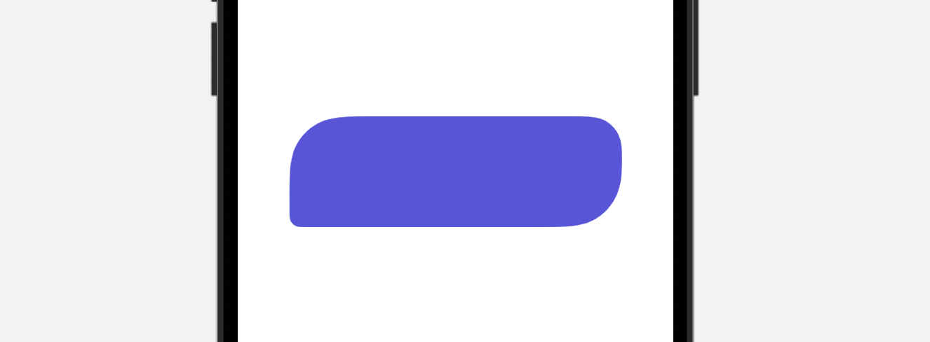
With UnevenRoundedRectangle, you can easily create rectangular shapes with rounded corners of different radii. To use UnevenRoundedRectangle, you simply need to specify the corner radius for each corner. Here is an example:
UnevenRoundedRectangle(cornerRadii: .init(
                                                    topLeading: 50.0,
                                                    bottomLeading: 10.0,
                                                    bottomTrailing: 50.0,
                                                    topTrailing: 30.0),
                                                    style: .continuous)
    .frame(width: 300, height: 100)
    .foregroundStyle(.indigo)
Optionally, you can indicate the style of the corners. A continuous corner style will give the corners a smoother look. If you’ve put the code above in Xcode 15, you can create a rectangular shape like below.

You can use this shape and transform it into a button by using the background modifier. Here is a sample code snippet:
Button(action: {

}) {
    Text("Register")
        .font(.title)
}
.tint(.white)
.frame(width: 300, height: 100)
.background {
    UnevenRoundedRectangle(cornerRadii: .init(
                                                        topLeading: 50.0,
                                                        bottomLeading: 10.0,
                                                        bottomTrailing: 50.0,
                                                        topTrailing: 30.0),
                                                        style: .continuous)
        .foregroundStyle(.indigo)
}
Animating the Rounded Corners

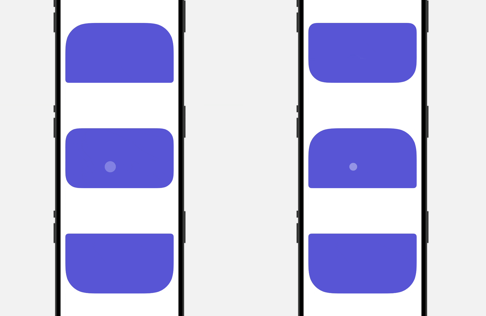
To animate the rounded corners of the UnevenRoundedRectangle, you can use the withAnimation function and toggle a Boolean variable. Here is an example code snippet:
struct AnimatedCornerView: View {

    @State private var animate = false

    var body: some View {

        UnevenRoundedRectangle(cornerRadii: .init(
                                    topLeading: animate ? 10.0 : 80.0,
                                    bottomLeading: animate ? 80.0 : 10.0,
                                    bottomTrailing: animate ? 80.0 : 10.0,
                                    topTrailing: animate ? 10.0 : 80.0))
            .foregroundStyle(.indigo)
            .frame(height: 200)
            .padding()
            .onTapGesture {
                withAnimation {
                    animate.toggle()
                }
            }

    }
}
In this example, tapping the rectangle will toggle the animate variable, which controls the corner radii of the rectangle. The withAnimation function will animate the transition between the two sets of corner radii.
Creating Unique Shapes

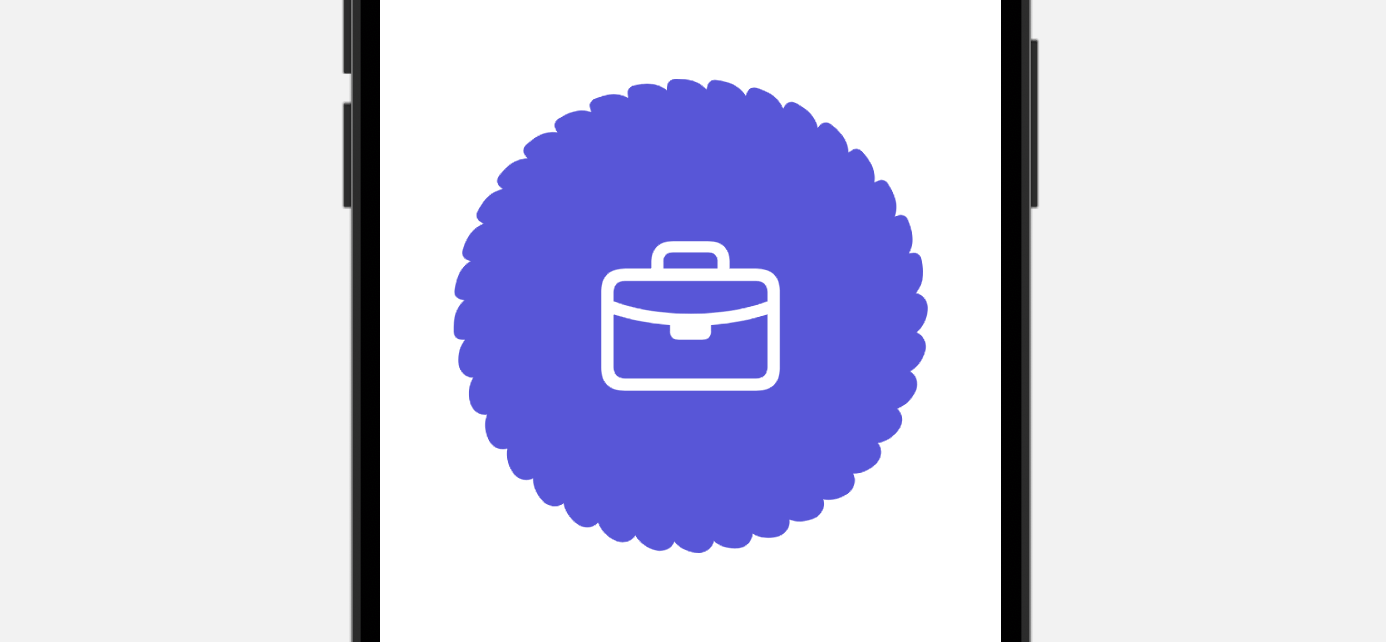
By overlapping multiple UnevenRoundedRectangle views, you can create a wide variety of shapes. The example provided above demonstrates how to create the specific shape shown using the following code:
ZStack {
    ForEach(0..<18, id: \.self) { index in
        UnevenRoundedRectangle(cornerRadii: .init(topLeading: 20.0, bottomLeading: 5.0, bottomTrailing: 20.0, topTrailing: 10.0), style: .continuous)
            .foregroundStyle(.indigo)
            .frame(width: 300, height: 30)
            .rotationEffect(.degrees(Double(10 * index)))
    }
}
.overlay {
    Image(systemName: "briefcase")
        .foregroundStyle(.white)
        .font(.system(size: 100))
}
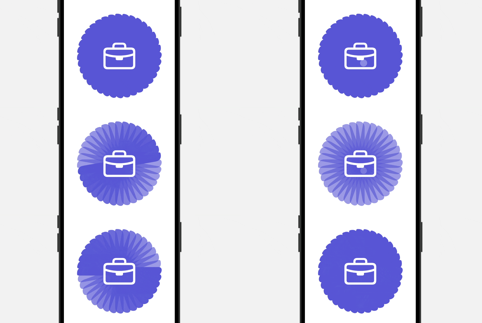
To add an additional visual effect, you can animate the change in opacity by modifying the code as follows:
ZStack {
    ForEach(0..<18, id: \.self) { index in
        UnevenRoundedRectangle(cornerRadii: .init(topLeading: 20.0, bottomLeading: 5.0, bottomTrailing: 20.0, topTrailing: 10.0), style: .continuous)
            .foregroundStyle(.indigo)
            .frame(width: 300, height: 30)
            .opacity(animate ? 0.6 : 1.0)
            .rotationEffect(.degrees(Double(10 * index)))
            .animation(.easeInOut.delay(Double(index) * 0.02), value: animate)
    }
}
.overlay {
    Image(systemName: "briefcase")
        .foregroundStyle(.white)
        .font(.system(size: 100))
}
.onTapGesture {
    animate.toggle()
}
Implementing this modification will result in a visually captivating effect that adds an extra level of interest to your design.

Summary
The addition of the UnevenRoundedRectangle view in SwiftUI provides developers with a convenient solution for rounding specific corners of rectangular views. It also gives you the flexibility and options to achieve the look you want. With the UnevenRoundedRectangle shape, you can seamlessly incorporate unique and eye-catching shapes into your app, enhancing its overall design and user experience.
To access the full content and the complete source code, please get your copy at https://www.appcoda.com/swiftui.