Chapter 17
Understanding Gestures
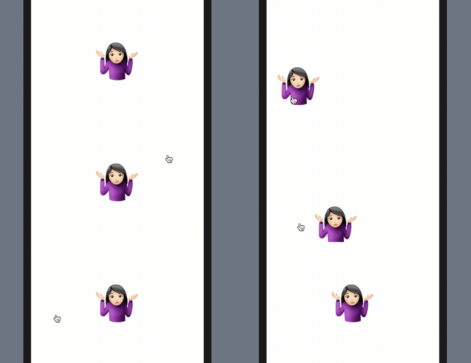
In earlier chapters, you got a taste of building gestures with SwiftUI. We used the onTapGesture modifier to handle a user's touch and provide a corresponding response. In this chapter, let's dive deeper and explore how to work with various types of gestures in SwiftUI.
The SwiftUI framework provides several built-in gestures, such as the tap gesture we have used before. Additionally, there are gestures like DragGesture, MagnificationGesture, and LongPressGesture that are ready to use. We will explore a couple of these gestures and see how to work with them in SwiftUI. Moreover, you will learn how to build a generic view that supports the drag gesture.
Using the Gesture Modifier
To recognize a particular gesture using SwiftUI, you can attach a gesture recognizer to a view using the .gesture modifier. Here is a sample code snippet that attaches a TapGesture using the .gesture modifier:
var body: some View {
    Image(systemName: "star.circle.fill")
        .font(.system(size: 200))
        .foregroundColor(.green)
        .gesture(
            TapGesture()
                .onEnded({
                    print("Tapped!")
                })
        )
}
If you want to try out the code, create a new project using the App template and make sure you select SwiftUI for the Interface option. Then, paste the code into ContentView.swift.
By modifying the code above slightly and introducing a state variable, we can create a simple scale animation when the star image is tapped. Here is the updated code:
struct ContentView: View {
    @State private var isPressed = false

    var body: some View {
        Image(systemName: "star.circle.fill")
            .font(.system(size: 200))
            .scaleEffect(isPressed ? 0.5 : 1.0)
            .animation(.easeInOut, value: isPressed)
            .foregroundColor(.green)
            .gesture(
                TapGesture()
                    .onEnded({
                        self.isPressed.toggle()
                    })
            )
    }
}
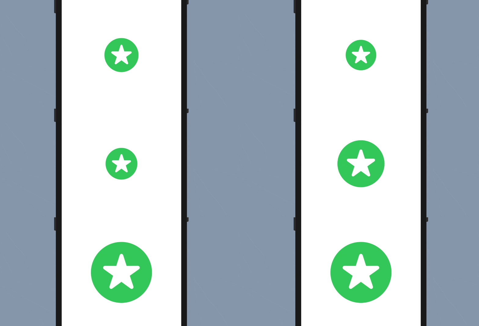
When you run the code in the canvas or simulator, you should see a scaling effect. This demonstrates how to use the .gesture modifier to detect and respond to specific touch events. If you need a refresher on how animations work, please refer back to chapter 9.
Using Long Press Gesture
One of the built-in gestures is LongPressGesture. This gesture recognizer allows you to detect a long-press event. For example, if you want to resize the star image only when the user presses and holds it for at least 1 second, you can use the LongPressGesture to detect the touch event.
Modify the code in the .gesture modifier like this to implement the LongPressGesture:
.gesture(
    LongPressGesture(minimumDuration: 1.0)
        .onEnded({ _ in
            self.isPressed.toggle()
        })
)
In the preview canvas, you have to press and hold the star image for at least a second before it toggles its size.
The @GestureState Property Wrapper
When you press and hold the star image, the image doesn't give the user any response until the long-press event is detected. Obviously, there is something we can do to improve the user experience. What I want to do is to give the user immediate feedback when he/she taps the image. Any kind of feedback will help to improve the situation. Let's dim the image a bit when the user taps it. This will let the user know that our app captures the touch and is doing work. Figure 3 illustrates how the animation works.

To implement the animation, you need to keep track of the state of gestures. During the performance of the long press gesture, we have to differentiate between tap and long press events. So, how do we do that?
SwiftUI provides a property wrapper called @GestureState which conveniently tracks the state change of a gesture and lets developers decide the corresponding action. To implement the animation we just described, we can declare a property using @GestureState like this:
@GestureState private var longPressTap = false
This gesture state variable indicates whether a tap event is detected during the performance of the long press gesture. Once you have the variable defined, you can modify the code of the Image view like this:
Image(systemName: "star.circle.fill")
    .font(.system(size: 200))
    .opacity(longPressTap ? 0.4 : 1.0)
    .scaleEffect(isPressed ? 0.5 : 1.0)
    .animation(.easeInOut, value: isPressed)
    .foregroundColor(.green)
    .gesture(
        LongPressGesture(minimumDuration: 1.0)
            .updating($longPressTap, body: { (currentState, state, transaction) in
                state = currentState
            })
            .onEnded({ _ in
                self.isPressed.toggle()
            })
    )
We only made a couple of changes in the code above. First, we added the .opacity modifier. When the tap event is detected, we set the opacity value to 0.4 so that the image becomes dimmer.
Second, we added the updating method of the LongPressGesture. During the performance of the long press gesture, this method will be called. It accepts three parameters: value, state, and transaction:
- The value parameter is the current state of the gesture. This value varies from gesture to gesture, but for the long press gesture, a
truevalue indicates that a tap is detected. - The state parameter is actually an in-out parameter that lets you update the value of the
longPressTapproperty. In the code above, we set the value ofstatetocurrentState. In other words, thelongPressTapproperty always keeps track of the latest state of the long press gesture. - The
transactionparameter stores the context of the current state-processing update.
After you make the code change, run the project in the preview canvas to test it. The image immediately becomes dimmer when you tap it. Keep holding it for one second, and then the image resizes itself.
The opacity of the image is automatically reset to normal when the user releases the long press. Do you wonder why? This is an advantage of @GestureState. When the gesture ends, it automatically sets the value of the gesture state property to its initial value, false in our case.
Using Drag Gesture
Now that you understand how to use the .gesture modifier and @GestureState, let's look into another common gesture: Drag. We are going to modify the existing code to support the drag gesture, allowing a user to drag the star image to move it around.
Replace the ContentView struct like this:
struct ContentView: View {
    @GestureState private var dragOffset = CGSize.zero

    var body: some View {
        Image(systemName: "star.circle.fill")
            .font(.system(size: 100))
            .offset(x: dragOffset.width, y: dragOffset.height)
            .animation(.easeInOut, value: dragOffset)
            .foregroundColor(.green)
            .gesture(
                DragGesture()
                    .updating($dragOffset, body: { (value, state, transaction) in

                        state = value.translation
                    })
            )
    }
}
To recognize a drag gesture, you initialize a DragGesture instance and listen for updates. In the update function, we use a gesture state property to keep track of the drag event. Similar to the long press gesture, the closure of the update function accepts three parameters. In this case, the value parameter stores the current data of the drag, including the translation. We set the state variable, which is actually the dragOffset, to value.translation.
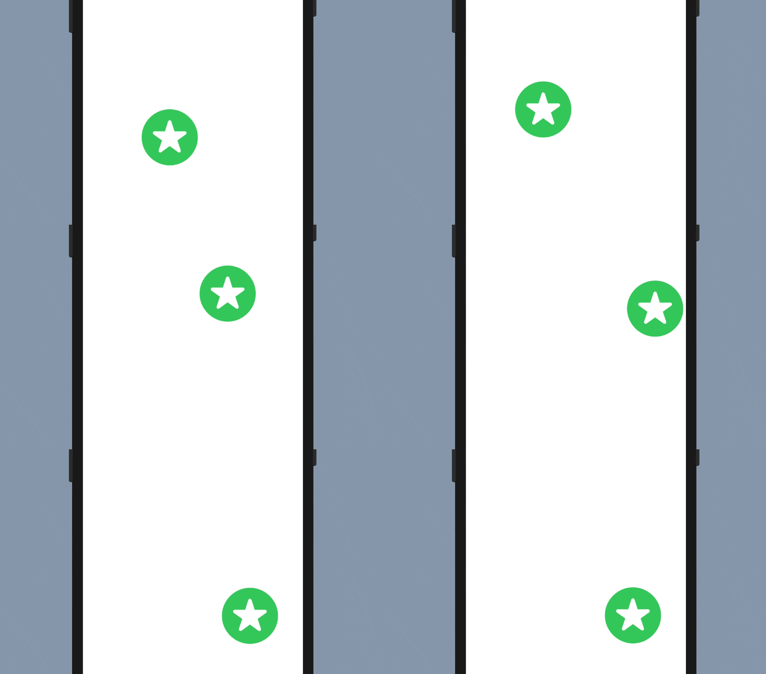
Test the project in the preview canvas and try dragging the image around. When you release it, the image returns to its original position.
You may be wondering why the image returns to its starting point. As explained in the previous section, one advantage of using @GestureState is that it resets the value of the property to its original value when the gesture ends. Therefore, when you end the drag and release the press, the dragOffset is reset to .zero, which is its original position.
But what if you want the image to stay at the end point of the drag? How can you achieve that? Take a few minutes to think about how to implement it.
Since the @GestureState property wrapper will reset the property to its original value, we need another state property to save the final position. Let's declare a new state property called finalOffset as a CGSize to store the final position of the dragged image:
@State private var position = CGSize.zero
Next, update the body variable like this:
var body: some View {
    Image(systemName: "star.circle.fill")
        .font(.system(size: 100))
        .offset(x: position.width + dragOffset.width, y: position.height + dragOffset.height)
        .animation(.easeInOut, value: dragOffset)
        .foregroundColor(.green)
        .gesture(
            DragGesture()
                .updating($dragOffset, body: { (value, state, transaction) in

                    state = value.translation
                })
                .onEnded({ (value) in
                    self.position.height += value.translation.height
                    self.position.width += value.translation.width
                })
        )
}
We have made a couple of changes to the code:
- We implemented the
onEndedfunction which is called when the drag gesture ends. In the closure, we compute the new position of the image by adding the drag offset. - The
.offsetmodifier was also updated, such that we take the current position into account.
Now when you run the project and drag the image, the image stays where it is even after the drag ends.
Combining Gestures
In some cases, you need to use multiple gesture recognizers in the same view. Let's say, we want the user to press and hold the image before starting the drag, we have to combine both long press and drag gestures. SwiftUI allows you to easily combine gestures to perform more complex interactions. It provides three gesture composition types including simultaneous, sequenced, and exclusive.
When you need to detect multiple gestures at the same time, you use the simultaneous composition type. When you combine gestures using the exclusive composition type, SwiftUI recognizes all the gestures you specify but it will ignore the rest when one of the gestures is detected.
As the name suggests, if you combine multiple gestures using the sequenced composition type, SwiftUI recognizes the gestures in a specific order. This is the type of the composition that we will use to sequence the long press and drag gestures.
To work with multiple gestures, you update the code like this:
struct ContentView: View {
    // For long press gesture
    @GestureState private var isPressed = false

    // For drag gesture
    @GestureState private var dragOffset = CGSize.zero
    @State private var position = CGSize.zero

    var body: some View {
        Image(systemName: "star.circle.fill")
            .font(.system(size: 100))
            .opacity(isPressed ? 0.5 : 1.0)
            .offset(x: position.width + dragOffset.width, y: position.height + dragOffset.height)
            .animation(.easeInOut, value: dragOffset)
            .foregroundColor(.green)
            .gesture(
                LongPressGesture(minimumDuration: 1.0)
                .updating($isPressed, body: { (currentState, state, transaction) in
                    state = currentState
                })
                .sequenced(before: DragGesture())
                .updating($dragOffset, body: { (value, state, transaction) in

                    switch value {
                    case .first(true):
                        print("Tapping")
                    case .second(true, let drag):
                        state = drag?.translation ?? .zero
                    default:
                        break
                    }

                })
                .onEnded({ (value) in

                    guard case .second(true, let drag?) = value else {
                        return
                    }

                    self.position.height += drag.translation.height
                    self.position.width += drag.translation.width
                })
            )
    }
}
You should already be familiar with some parts of the code snippet as we are combining the previously implemented long press gesture with the drag gesture.
Let's go through the code in the .gesture modifier line by line. We require the user to press and hold the image for at least one second before they can begin dragging it. We start by creating the LongPressGesture. Similar to our previous implementation, we have a isPressed gesture state property that controls the opacity of the image when tapped.
The keyword sequenced is used to link the long press and drag gestures together. We tell SwiftUI that the LongPressGesture should occur before the DragGesture.
The code in both the updating and onEnded functions looks quite similar, but the value parameter now contains data from both gestures (i.e., long press and drag). We use a switch statement to differentiate between the gestures. You can use the .first and .second cases to determine which gesture is being handled. Since the long press gesture should be recognized before the drag gesture, the first gesture here refers to the long press gesture. In the code, we simply print the Tapping message for reference.
When the long press is confirmed, we reach the .second case. Here, we extract the drag data and update the dragOffset property with the corresponding translation.
When the drag ends, the onEnded function is called. Similarly, we update the final position by retrieving the drag data (i.e., .second case).
Now you're ready to test the combination of gestures. Run the app in the preview canvas using the debug preview so that you can see the message in the console. You won't be able to drag the image until you hold the star image for at least one second.

Refactoring the Code Using Enum
A better way to organize the drag state is by using Enum. This allows you to combine the isPressed and dragOffset state into a single property. Let's declare an enumeration called DragState.
enum DragState {
    case inactive
    case pressing
    case dragging(translation: CGSize)

    var translation: CGSize {
        switch self {
        case .inactive, .pressing:
            return .zero
        case .dragging(let translation):
            return translation
        }
    }

    var isPressing: Bool {
        switch self {
        case .pressing, .dragging:
            return true
        case .inactive:
            return false
        }
    }
}
We have three states here: inactive, pressing, and dragging. These states are good enough to represent the states during the performance of the long press and drag gestures. For the dragging state, we associate it with the translation of the drag.
With the DragState enum, we can modify the original code like this:
struct ContentView: View {
    @GestureState private var dragState = DragState.inactive
    @State private var position = CGSize.zero

    var body: some View {
        Image(systemName: "star.circle.fill")
            .font(.system(size: 100))
            .opacity(dragState.isPressing ? 0.5 : 1.0)
            .offset(x: position.width + dragState.translation.width, y: position.height + dragState.translation.height)
            .animation(.easeInOut, value: dragState.translation)
            .foregroundColor(.green)
            .gesture(
                LongPressGesture(minimumDuration: 1.0)
                .sequenced(before: DragGesture())
                .updating($dragState, body: { (value, state, transaction) in

                    switch value {
                    case .first(true):
                        state = .pressing
                    case .second(true, let drag):
                        state = .dragging(translation: drag?.translation ?? .zero)
                    default:
                        break
                    }

                })
                .onEnded({ (value) in

                    guard case .second(true, let drag?) = value else {
                        return
                    }

                    self.position.height += drag.translation.height
                    self.position.width += drag.translation.width
                })
            )
    }
}
We have now declared a dragState property to track the state of the drag gesture. By default, it is set to DragState.inactive. The code is very similar to the previous implementation, but it has been modified to work with the dragState property instead of isPressed and dragOffset. For instance, in the .offset modifier, we retrieve the drag offset from the associated value of the dragging state.
The outcome of the code remains the same. However, it is considered good practice to use an enum to track complex states of gestures.
Building a Generic Draggable View
So far, we have successfully built a draggable image view. But, what if we want to build a draggable text view or a draggable circle? Should we just copy and paste all the code to create the text view or circle?
There is a better way to implement that. Let's see how we can build a generic draggable view.
In the project navigator, right click the SwiftUIGesture folder and choose New File.... Select the SwiftUI View template and name the file DraggableView.
Declare the DragState enum and update the DraggableView struct like this:
enum DraggableState {
    case inactive
    case pressing
    case dragging(translation: CGSize)

    var translation: CGSize {
        switch self {
        case .inactive, .pressing:
            return .zero
        case .dragging(let translation):
            return translation
        }
    }

    var isPressing: Bool {
        switch self {
        case .pressing, .dragging:
            return true
        case .inactive:
            return false
        }
    }
}

struct DraggableView<Content>: View where Content: View {
    @GestureState private var dragState = DraggableState.inactive
    @State private var position = CGSize.zero

    var content: () -> Content

    var body: some View {
        content()
            .opacity(dragState.isPressing ? 0.5 : 1.0)
            .offset(x: position.width + dragState.translation.width, y: position.height + dragState.translation.height)
            .animation(.easeInOut, value: dragState.translation)
            .gesture(
                LongPressGesture(minimumDuration: 1.0)
                .sequenced(before: DragGesture())
                .updating($dragState, body: { (value, state, transaction) in

                    switch value {
                    case .first(true):
                        state = .pressing
                    case .second(true, let drag):
                        state = .dragging(translation: drag?.translation ?? .zero)
                    default:
                        break
                    }

                })
                .onEnded({ (value) in

                    guard case .second(true, let drag?) = value else {
                        return
                    }

                    self.position.height += drag.translation.height
                    self.position.width += drag.translation.width
                })
            )
    }
}
All of the code is very similar to what we have written before. The key is to declare DraggableView as a generic view and create a content property that accepts any View. We then apply the long press and drag gestures to this content view.
Now you can test this generic view by replacing the #Preview code block like this:
#Preview {
    DraggableView() {
        Image(systemName: "star.circle.fill")
            .font(.system(size: 100))
            .foregroundColor(.green)
    }
}
In the code, we initialize a DraggableView and provide our own content, which in this case is the star image. By doing so, we create a reusable DraggableView that supports the long press and drag gestures, and we can use it with any content we want.
So, what if we want to build a draggable text view? You can replace the code snippet with the following code:
#Preview {
    DraggableView() {
        Text("Swift")
            .font(.system(size: 50, weight: .bold, design: .rounded))
            .bold()
            .foregroundColor(.red)
    }
}
In the closure, we create a text view instead of an image view. If you run the project in the preview canvas, you can drag the text view to move it around (remember to long press for 1 second). It's pretty cool, isn't it?

If you want to create a draggable circle, you can replace the code like this:
#Preview {
    DraggableView() {
        Circle()
            .frame(width: 100, height: 100)
            .foregroundColor(.purple)
    }
}
That's how you create a generic draggable. Try to replace the circle with other views to make your own draggable view and have fun!
Exercise
We've explored three built-in gestures in this chapter: tap, drag, and long press. However, there are a couple more gestures we haven't explored yet. As an exercise, try to create a generic scalable view that can recognize the MagnificationGesture and scale any given view accordingly. Figure 7 shows a sample result.

Summary
The SwiftUI framework has made gesture handling incredibly easy. As you've learned in this chapter, the framework provides several ready-to-use gesture recognizers. Enabling a view to support a specific type of gesture is as simple as attaching the .gesture modifier to it. Composing multiple gestures has also become much more straightforward.
It's a growing trend to build gesture-driven user interfaces for mobile apps. With the user-friendly API provided by SwiftUI, you can now empower your apps with useful gestures to delight your users.
To access the full content and the complete source code, please get your copy at https://www.appcoda.com/swiftui.