Chapter 44
Creating Grid Layout Using Grid APIs
SwiftUI introduced a new Grid API for composing grid-based layout along with the release of iOS 16. While you can arrange the same layout using VStack and HStack, the Grid view makes it a lot easier. A Grid view is a container view that arranges other views in a two-dimensional layout.
The Basics
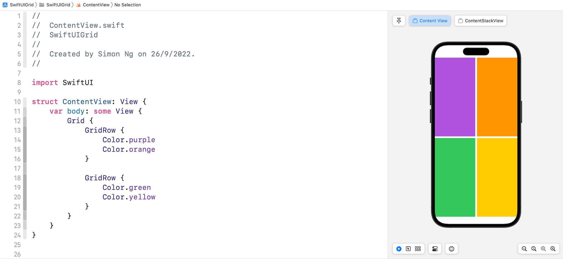
Let's start with a simple grid. To create a 2x2 grid, you write the code like below:
struct ContentView: View {
    var body: some View {
        Grid {
            GridRow {
                Color.purple
                Color.orange
            }

            GridRow {
                Color.green
                Color.yellow
            }
        }
    }
}
Assuming you've created a SwiftUI project in Xcode, you should see a 2x2 grid, filled with different colors.

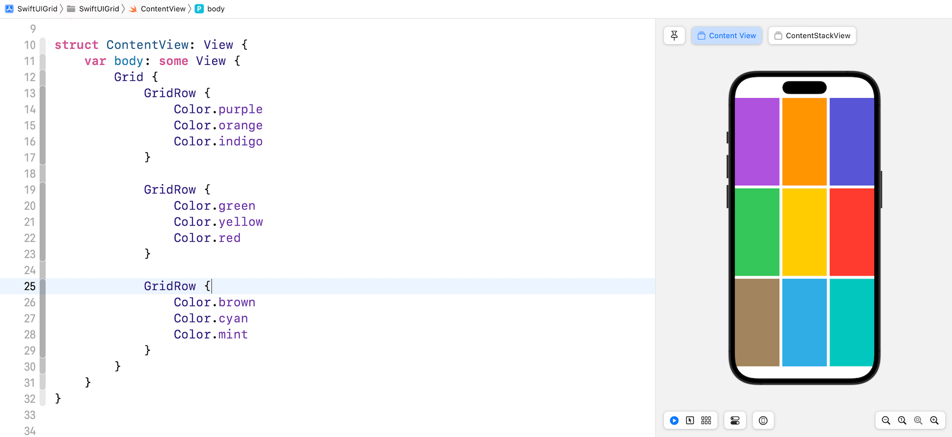
To create a 3x3 grid, you just need to add another GridRow. And, for each GridRow, you insert one more child view.

Comparing Grid Views and Stack Views
You may be wondering why we need to use the Grid APIs when we can create the same grid UI using HStack and VStack. So, why did Apple introduce these new APIs? It's true that you can build the same grid with stack views. However, there is a major difference that makes Grid views more desirable when building grid layouts.
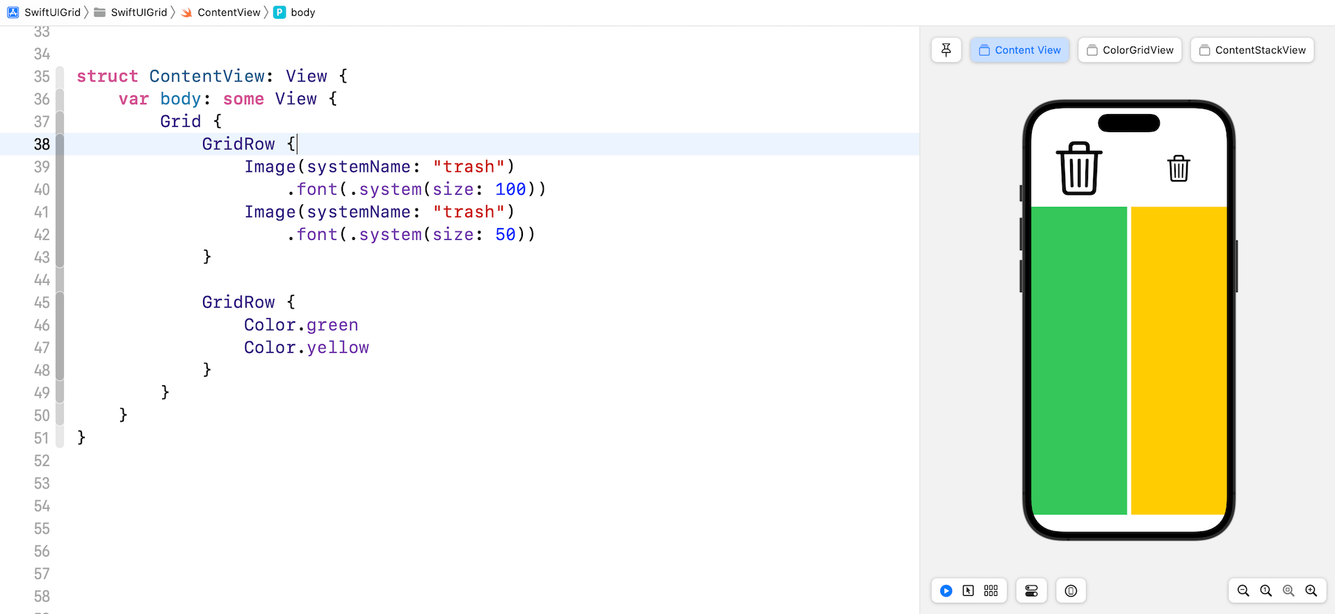
Let's create another 2x2 grid using the code below:
struct ContentView: View {
    var body: some View {
        Grid {
            GridRow {
                Image(systemName: "trash")
                    .font(.system(size: 100))
                Image(systemName: "trash")
                    .font(.system(size: 50))
            }

            GridRow {
                Color.green
                Color.yellow
            }
        }
    }
}
This time, the first row displays two system images and the second row shows the color views. Your preview should show a grid like below.

To access the full content and the complete source code, please get your copy at https://www.appcoda.com/swiftui.