Chapter 19
Creating a Tinder-like UI with Gestures and Animations
Wasn't it enjoyable to build an expandable bottom sheet? Now, let's take our newfound knowledge about gestures and apply it to a real-world project. Perhaps you're familiar with the Tinder app or have encountered a Tinder-like user interface in other applications. The swiping motion has become a central element of Tinder's UI design and has emerged as one of the most popular mobile UI patterns. Users can swipe right to like a photo or swipe left to dislike it.
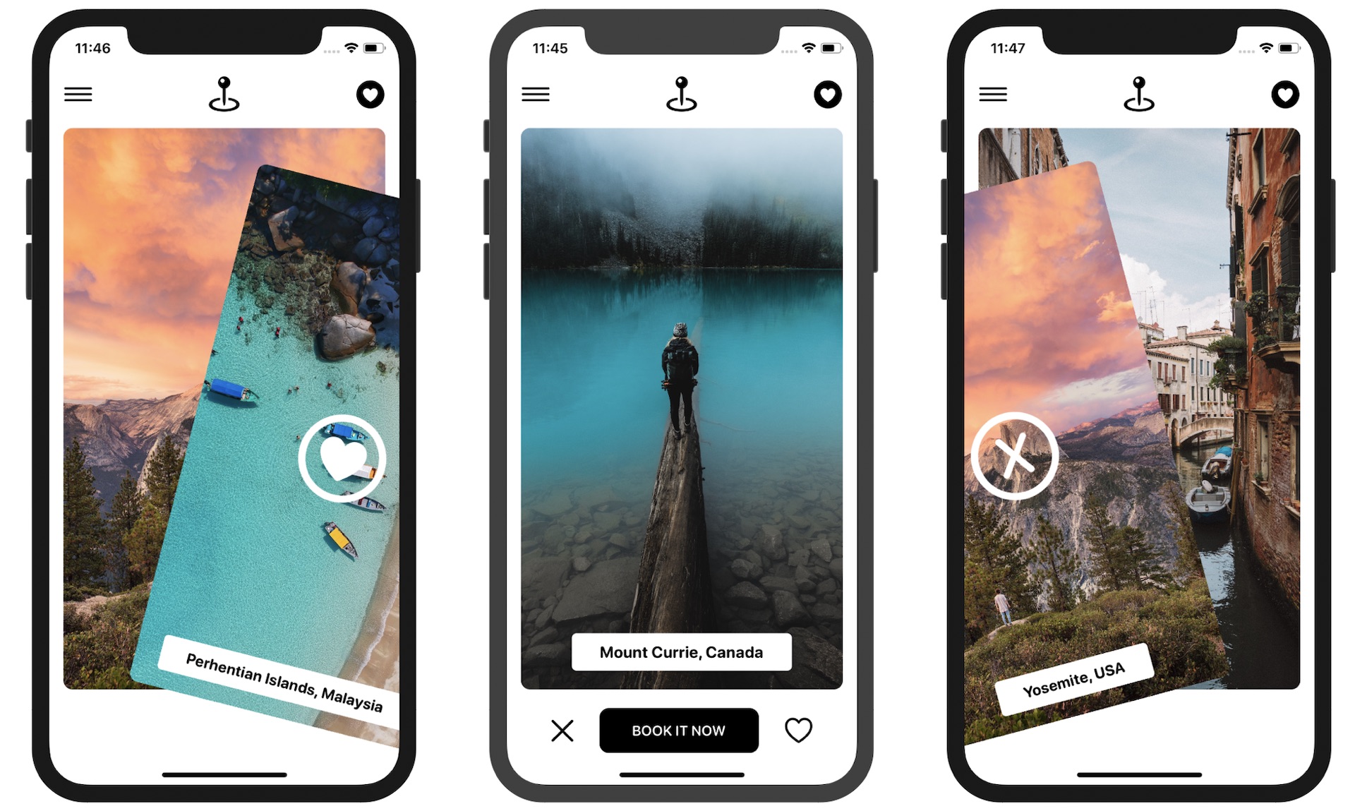
In this chapter, our goal is to create a simple app featuring a Tinder-like UI. The app will present users with a deck of travel cards and enable them to utilize the swipe gesture to either like or dislike a card.

Let's dive into the project and explore the process of implementing this interactive and engaging user interface. Please note that we are not going to build a fully functional app but focus only on the Tinder-like UI.
To access the full content and the complete source code, please get your copy at https://www.appcoda.com/swiftui.