Chapter 15
View Animations and Blur Effect

Animation can explain whatever the mind of man can conceive. This facility makes it the most versatile and explicit means of communication yet devised for quick mass appreciation.
– Walt Disney
First and foremost, let's clarify what an animation is and how it is created. Animation refers to the simulation of motion and shape transformation by rapidly displaying a sequence of static images or frames. It creates the illusion that an object is in motion or changing in size.
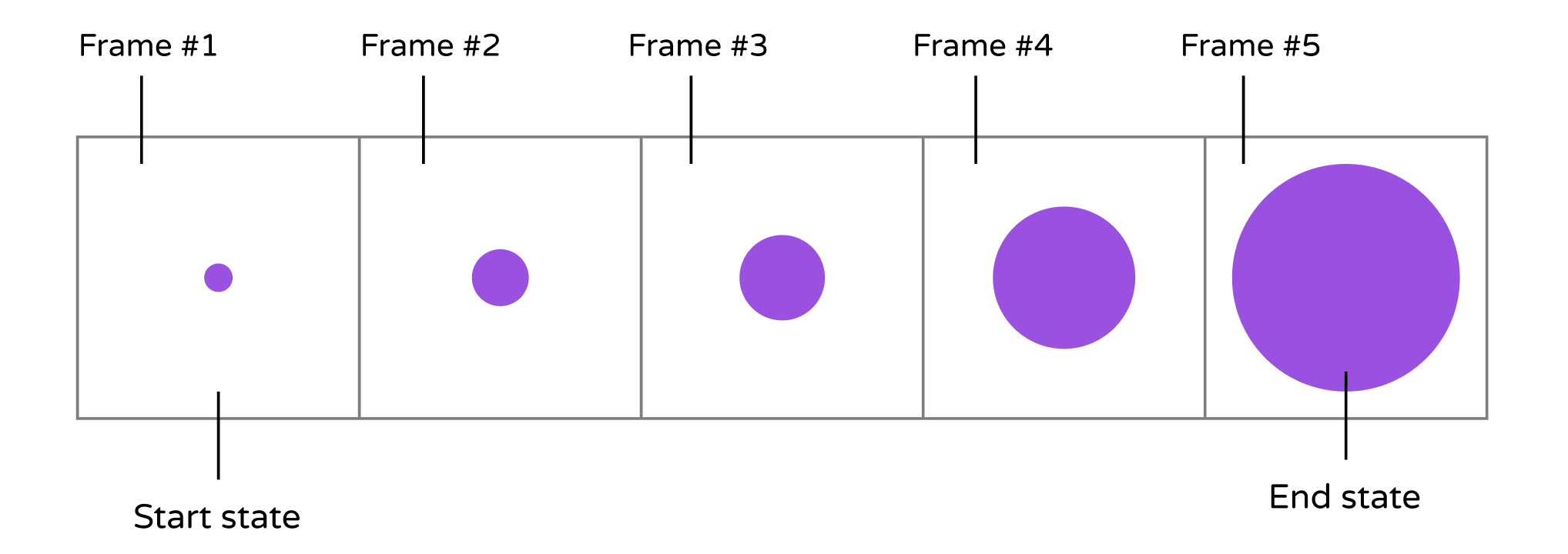
For example, a growing circle animation is achieved by displaying a series of frames. It begins with a dot, and each subsequent frame features a slightly larger circle than the previous one. This sequence of frames creates the illusion that the dot is progressively growing larger. Figure 15-1 depicts the sequence of static images. To keep the example simple, the figure displays only five frames. However, to achieve a seamless transition and a more fluid animation, one would need to develop several additional frames.

Now that you have a basic understanding of how animation works, let's explore how to create animations in SwiftUI. Let's consider our growing circle example. We know that the animation begins with a dot (the start state) and ends with a large red circle (the end state). The challenge lies in generating the frames between these two states. Do you need to devise an algorithm and write hundreds of lines of code to generate the series of frames in between? Absolutely not. SwiftUI handles all the heavy lifting for you. The framework assists in computing the frames between the start and end states, resulting in a seamless animation.
Have you ever used the "Magic Move" animation feature in Keynote? With "Magic Move," you can effortlessly create smooth transitions between slides. Keynote automatically analyzes the objects between slides and generates the animations automatically. To me, SwiftUI has brought the concept of "Magic Move" to app development. Animations using the SwiftUI framework are automatic and seemingly magical. You define the two states of a view, and SwiftUI takes care of the rest, animating the changes between the two states.
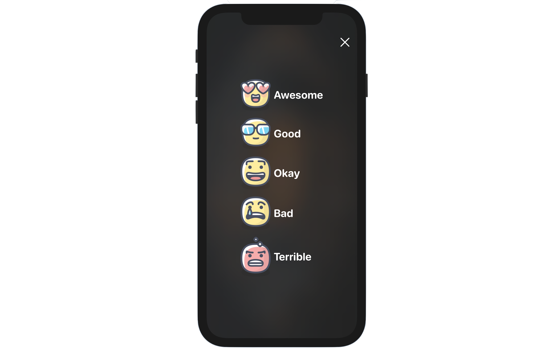
There is no better way to grasp the technique than by working on a practical example. In this chapter, we will create a new Rate button in the detail view. When the button is tapped, the app will present a Review view where users can select the rating for the restaurant. To enhance the user experience, we will incorporate a blurring effect and animations into the Review view.

To access the full version of the book, please get the full copy here. You will also be able to access the full source code of the project.