Chapter 21
Building Walkthrough Screens with UIPageViewController and Container Views

If you're interested in the living heart of what you do, focus on building things rather than talking about them.
- Ryan Freitas, About.me
For the very first time launching an app, you probably find a series of walkthrough (or tutorial) screens. It's a common practice for mobile apps to step users through a multi-screen tutorial where all the features are demonstrated. Some said your app design probably fails if your app needs walkthrough screens. Personally, I don't hate walkthrough screens and find most of them pretty useful. Just make sure you keep it short. Don't take it too far to include long and boring tutorials. Here, I'm not going to argue with you whether you should or should not include walkthrough screens in your app. I just want to show you how.
In this chapter, we'll discuss how to use UIPageViewController to create walkthrough screens and you will learn how to use a special type of view known as Container View.

One of the ways to implement this type of walkthrough screen is to utilize the UIPageViewController class. It lets developers build pages of content, for which each page is managed by its own view controller. The class has a built-in support for scrolling transition. With UIPageViewController, users can easily navigate between multiple pages through simple gestures. The page view controller is not limited to creating walkthrough screens. You can find examples of page view implementation in games like Angry Birds (the page that shows all available levels) or in book apps (the page that displays the table of contents).
The UIPageViewController class is a highly configurable class. You're allowed to define:
- the orientation of the page views – vertical or horizontal
- the transition style – page curl transition style or scrolling transition style
- the location of the spine – only applicable to page curl transition style
- the space between pages – only applicable to scrolling transition style to define the inter-page spacing
We will add a simple walkthrough for the FoodPin app. By implementing this new feature, you will learn how UIPageViewController works along the way. That said, we'll not demonstrate every option of UIPageViewController; we'll just use the scrolling transition style to display a series of walkthrough screens. With the basic understanding of the UIPageViewController, however, I believe you should be able to explore other features in the page view controller.
Let's get started.
A Quick Look at the Walkthrough Screens
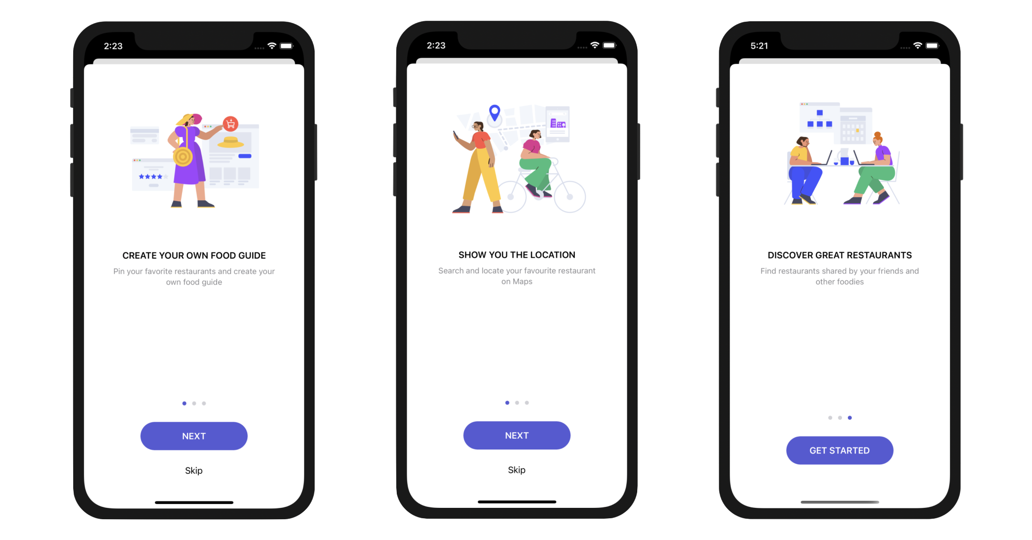
Let's have a quick look at the walkthrough screens. The app will display a total of three tutorial screens. The user will be able to navigate between pages by swiping through the screen or tapping the NEXT button.
In the last screen of the walkthrough, it displays a Get Started button. When the user taps the button, the walkthrough screen will be dismissed and never be shown again. At any time, the user can skip the walkthrough screens by tapping the Skip button. Figure 21-2 shows the screenshots of the walkthrough.

To access the full version of the book, please get the full copy here. You will also be able to access the full source code of the project.