In the earlier tutorial, we showed you how to work with TabView to display a tab bar interface. In iOS 14, Apple introduced a new style called PageTabViewStyle in the SwiftUI framework for developers to create paged scrolling interface. In this tutorial, we will show you how to implement his type of tab view style.
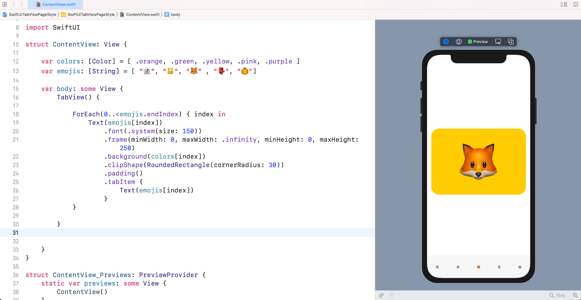
Let’s begin with a simple tab view. Assuming you’ve created a SwiftUI project, you can replace the ContentView struct like this:
struct ContentView: View {

    var colors: [Color] = [ .orange, .green, .yellow, .pink, .purple ]
    var emojis: [String] = [ "👻", "🐱", "🦊" , "👺", "🎃"]

    var body: some View {
        TabView() {

            ForEach(0..<emojis.endIndex) { index in
                Text(emojis[index])
                    .font(.system(size: 150))
                    .frame(minWidth: 0, maxWidth: .infinity, minHeight: 0, maxHeight: 250)
                    .background(colors[index])
                    .clipShape(RoundedRectangle(cornerRadius: 30))
                    .padding()
                    .tabItem {
                        Text(emojis[index])
                    }
            }

        }

    }
}
When you run the app in the preview canvas, this gives you a tab view with 5 tab items.

Creating a Paged Scrolling View
To convert a standard tab view to a paged scrolling view, all you need to do is attach the .tabViewStyle modifier and specify to use PageTabViewStyle like this:
.tabViewStyle(PageTabViewStyle())With just a line of code, you can convert a tab bar interface into a paged scrolling view.

Customizing the Page Indicator
In this style, the tab view automatically renders the paging indicator (i.e. those paging dots). You can easily see the dots in Dark mode. However, it’s impossible to locate the dots in light mode because both the dots and the background have the same color. To fix this issue, you can attach the indexViewStyle modifier to the TabView like this:
.indexViewStyle(PageIndexViewStyle(backgroundDisplayMode: .always))We pass an instance of PageIndexViewStyle, which set the backgroundDisplayMode to .always. This instructs iOS to render a semi-transparent background behind the paging dots.

It is not a mandate to display the paging indicator. If you do not need it, you can provide an additional parameter when instantiating PageTabViewStyle like this:
.tabViewStyle(PageTabViewStyle(indexDisplayMode: .never))By specifying the indexDisplayMode to .never, the paging dots will disappear. Furthermore, to adjust the position of the paging dots, you can attach the .frame modifier to TabView. Here is an example:
.frame(minWidth: 0, maxWidth: .infinity, minHeight: 0, maxHeight: 250)In the code above, we adjust the height of the tab view. By doing so, you can change the position of the paging indicator.

If you enjoy reading this tutorial and want to dive deeper into SwiftUI, you may check out our Mastering SwiftUI book.


