

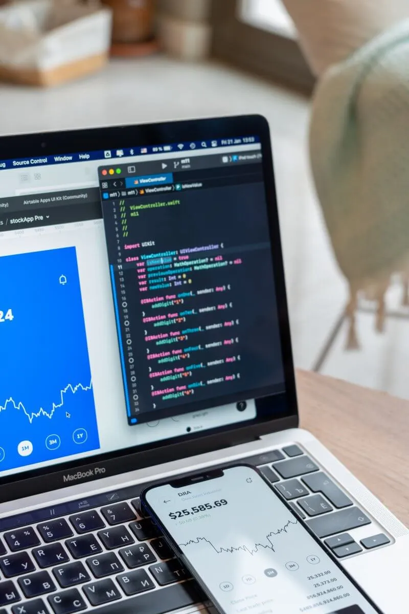
The world of SwiftUI is constantly evolving, with each update pushing the boundaries of app development. With iOS 18, the enhancements are both exciting and significant, set to transform how developers engage with SwiftUI.
This guide aims to explore every new feature and improvement in this version, offering a comprehensive overview of the changes.
The Floating Tab Bar
The Tab view in SwiftUI has been greatly enhanced with the addition of a floating tab bar. This new feature can seamlessly transition into a sidebar, providing users with an intuitive way to access the full functionality of an app.
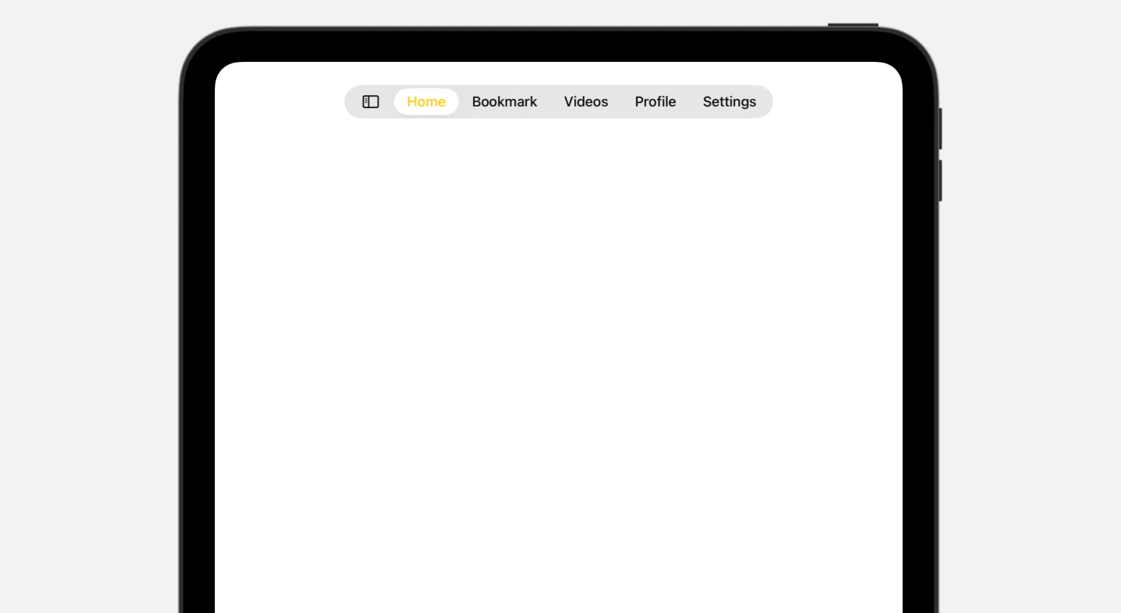
On iPad, users can now tap a sidebar button on the tab bar to transform the tab bar into sidebar. For developers, it’s just a line of code if you want to support this feature. All you need is to set the tab view style to .sidebarAdaptable:
struct ContentView: View {
    @State var customization = TabViewCustomization()

    var body: some View {
        TabView {
            Tab("Home", systemImage: "house.fill") {

            }

            Tab("Bookmark", systemImage: "bookmark.circle.fill") {

            }

            Tab("Videos", systemImage: "video.circle.fill") {

            }

            Tab("Profile", systemImage: "person.crop.circle") {

            }

            Tab("Settings", systemImage: "gear") {

            }

        }
        .tint(.yellow)
        .tabViewStyle(.sidebarAdaptable)
        .tabViewCustomization($customization)
    }
}
Once the option is set, users can effortlessly switch between a sidebar and a tab bar, enhancing navigation flexibility. Additionally, the new tab bar offers extensive customization. By attaching the .tabViewCustomization modifier to the Tab view, users can tailor the menu items of the tab bar.
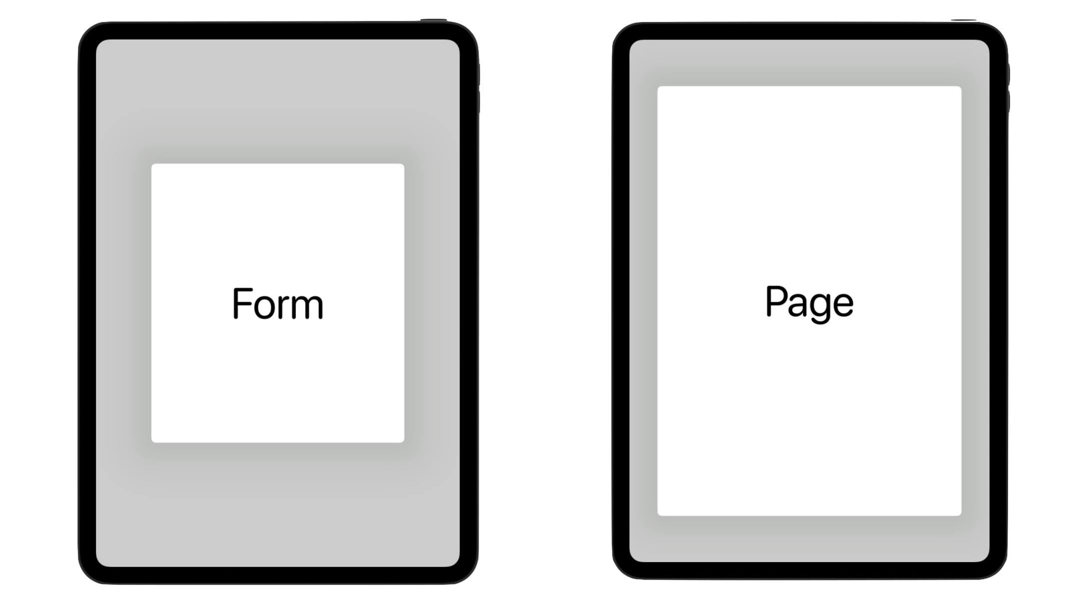
Sheet Presentation Sizing
Sheet presentation sizing is now consistent and streamlined across platforms. By using the .presentationSizing modifier, you can easily create sheets with ideal dimensions using presets such as .form or .page, or even specify custom sizes. Here is a sample:
struct PresentationSizingDemo: View {

    @State private var showSheet = false

    var body: some View {
        Button {
            showSheet.toggle()
        } label: {
            Text("Show sheet")
        }
        .sheet(isPresented: $showSheet) {
            Text("This is a quick demo of presentation sizing.")
                .presentationSizing(.form)
        }
    }
}
On iPad, the .form preset displays a smaller sheet compared to .page. However, there is no size difference on iPhone.
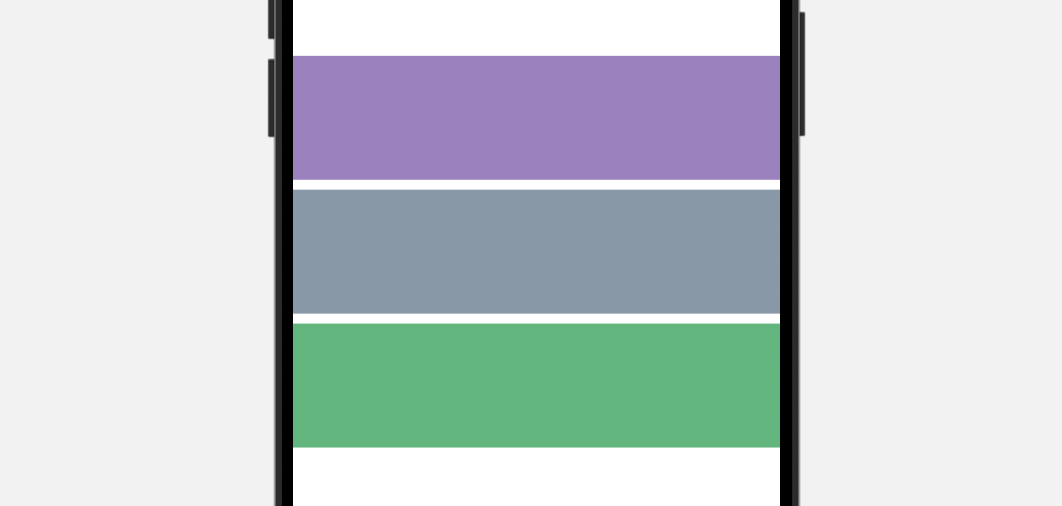
Color Mesh Gradients
SwiftUI now offers extensive support for colorful mesh gradients. The new MeshGradient feature allows you to create two-dimensional gradients using a grid of positioned colors. By combining control points and colors, you can design a wide variety of gradient effects.
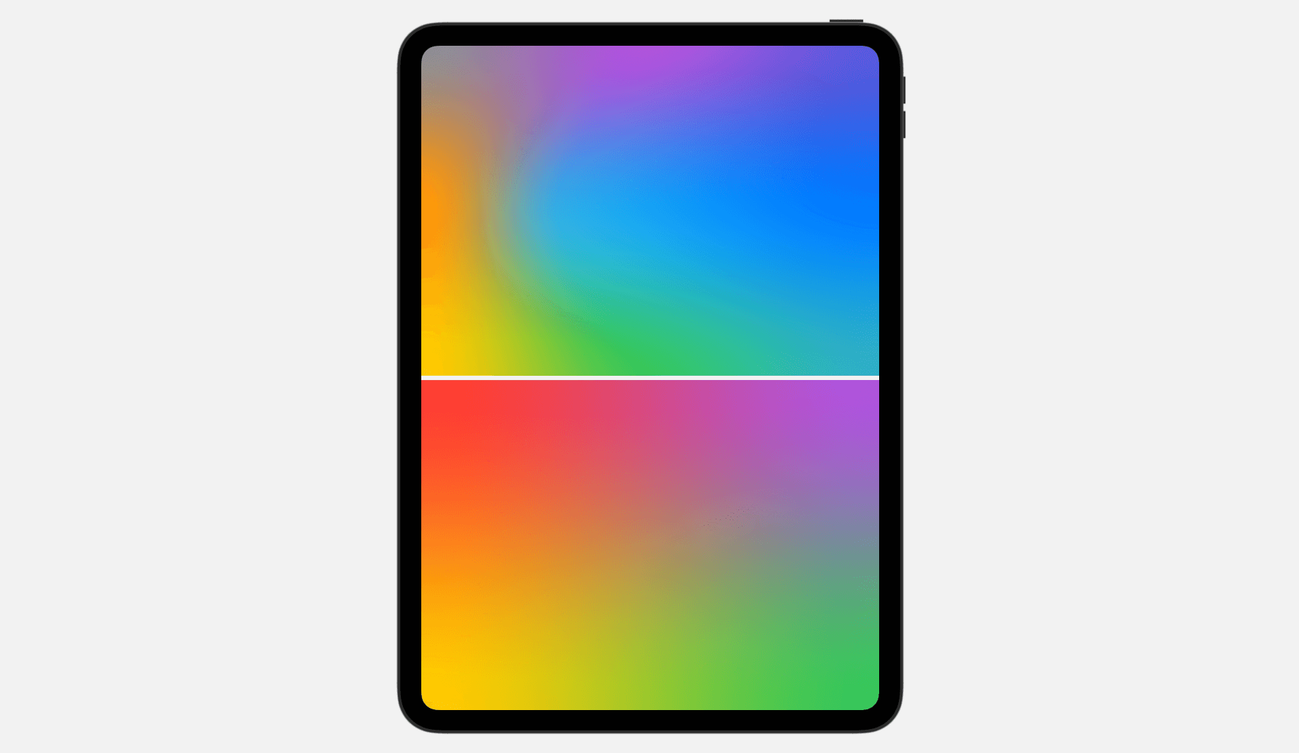
Below shows a couple of gradients created using MeshGradient:
struct ColorMeshDemo: View {
    var body: some View {
        VStack {
            MeshGradient(
                width: 3,
                height: 3,
                points: [
                    .init(0, 0), .init(0.5, 0), .init(1, 0),
                    .init(0, 0.5), .init(0.3, 0.5), .init(1, 0.5),
                    .init(0, 1), .init(0.5, 1), .init(1, 1)
                ],
                colors: [
                    .gray, .purple, .indigo,
                    .orange, .cyan, .blue,
                    .yellow, .green, .teal
                ]
            )

            MeshGradient(
                width: 2,
                height: 2,
                points: [
                    .init(0, 0), .init(1, 0),
                    .init(0, 1), .init(1, 1)
                ],
                colors: [
                    .red, .purple,
                    .yellow, .green
                ]
            )
        }
        .ignoresSafeArea()
    }
}
Zoom Transition
SwiftUI now has the built-in support of zoom transition. You can use the .matchedTransitionSource modifier to easily render the zoom transition.
If you're familiar with using matchedGeometryEffect, you'll find matchedTransitionSource quite similar. Below is sample code we wrote to create the zoom transition shown above:
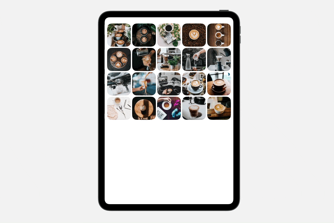
struct ZoomTransitionDemo: View {
    let samplePhotos = (1...20).map { Photo(name: "coffee-\($0)") }

    @Namespace() var namespace

    var body: some View {
        NavigationStack {
            ScrollView {
                LazyVGrid(columns: [ GridItem(.adaptive(minimum: 150)) ]) {

                    ForEach(samplePhotos) { photo in
                        NavigationLink {
                            Image(photo.name)
                                .resizable()
                                .navigationTransition(.zoom(sourceID: photo.id, in: namespace))
                        } label: {
                            Image(photo.name)
                                .resizable()
                                .scaledToFill()
                                .frame(minWidth: 0, maxWidth: .infinity)
                                .frame(height: 150)
                                .cornerRadius(30.0)
                        }
                        .matchedTransitionSource(id: photo.id, in: namespace)

                    }
                }
            }
        }
        .padding()
    }
}
The matchedTransitionSource modifier is applied to a NavigationLink with a specific photo ID, designating the view as the source of the navigation transition. For the destination view, which is also an Image view, the navigationTransition modifier is used to render the zoom transition.
More Animations for SF Symbols 6
iOS 17 introduced a fantastic collection of expressive animations for SF Symbols. Developers can leverage these animations using the new symbolEffect modifier. iOS 18 pushes the SF Symbols to version 6 with an even wider variety of animated symbols for developers to utilize in their apps.
Here is a sample code snippet for the new rotate animation:
Image(systemName: "ellipsis.message")
            .font(.system(size: 300))
            .symbolRenderingMode(.palette)
            .foregroundStyle(.purple, .gray)
            .symbolEffect(.rotate, value: animate)
            .onTapGesture {
                animate.toggle()
            }
On top of the rotate animation, SF Symbols 6 also provides two other types of animation including .wiggle and .breathe.
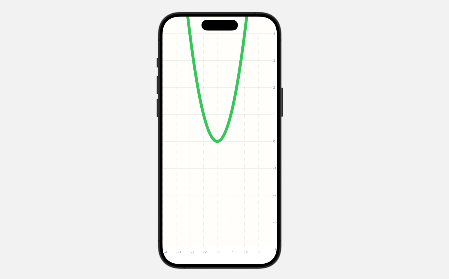
Enhancements of SwiftUI Charts
The SwiftUI Charts framework now supports vectorized and function plots. For example, let’s say you want to plot a graph for the following function:
y = x^2You can use LinePlot to plot the graph like this:
Chart {
    LinePlot(x: "x", y: "y") { x in
        return pow(x, 2)
    }
    .foregroundStyle(.green)
    .lineStyle(.init(lineWidth: 10))
}
.chartXScale(domain: -4...4)
.chartYScale(domain: -4...4)
.chartXAxis {
    AxisMarks(values: .automatic(desiredCount: 10))
}
.chartYAxis {
    AxisMarks(values: .automatic(desiredCount: 10))
}
.chartPlotStyle { plotArea in
    plotArea
        .background(.yellow.opacity(0.02))
}
You can simply provide the function to a LinePlot to graph a function.
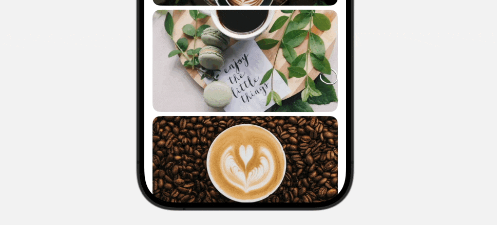
More Control of Scroll Views
The new version of SwiftUI delivers a powerful set of new APIs that give developers fine-grained control over their scroll views. The introduction of the onScrollGeometryChange modifier allows you to keep track with the state of scroll views. This new capability enables you to efficiently react to changes in the scroll view's content offsets, content size, and other scroll-related properties.
Here's a sample code snippet that demonstrates how you can use this modifier to display a "Scroll to Top" button after the user has scrolled down a list:
struct ScrollViewDemo: View {

    let samplePhotos = (1...20).map { Photo(name: "coffee-\($0)") }

    @State private var showScrollToTop = false

    var body: some View {
        ScrollView {
            VStack {
                ForEach(samplePhotos) { photo in
                    Image(photo.name)
                        .resizable()
                        .scaledToFill()
                        .frame(height: 200)
                        .clipShape(RoundedRectangle(cornerRadius: 15))
                }
            }
        }
        .padding(.horizontal)
        .overlay(alignment: .bottom) {
            if showScrollToTop {
                Button("Scroll to top") {

                }
                .controlSize(.extraLarge)
                .buttonStyle(.borderedProminent)
                .tint(.green)
            }
        }
        .onScrollGeometryChange(for: Bool.self) { geometry in
            geometry.contentOffset.y < geometry.contentInsets.bottom + 200

        } action: { oldValue, newValue in
            withAnimation {
                showScrollToTop = !newValue
            }
        }

    }
}
The geometry of a scroll view changes frequently while scrolling. We can leverage the onScrollGeometryChange modifier to capture the update and display the “Scroll to top” button accordingly.
SwiftUI also introduces the onScrollVisibilityChange modifier for views within a scroll view. This modifier allows you to detect when a particular view becomes visible and perform specific actions in response.
Suppose we have a Rectangle view at the end of a scroll view and we want to trigger a color change animation only when this view comes into view. We can use the onScrollVisibilityChange modifier to detect when the view becomes visible and when it goes off-screen.
Rectangle()
    .fill(color)
    .frame(height: 100)
    .onScrollVisibilityChange(threshold: 0.9) { visible in
        withAnimation(.linear(duration: 5)) {
            color = visible ? .green : .blue
        }
    }
Widgets in Control Center
You now have the ability to design custom resizable controls, like buttons and toggles, which can be placed in the Control Center or on the lock screen. Controls are a new kind of Widget that that are easy to build with App Intents.
To create a control widget in Control Center, you adopt the ControlWidget protocol and provide the implementation. Here is a sample code provided by Apple:
struct StartPartyControl: ControlWidget {
    var body: some ControlWidgetConfiguration {
        StaticControlConfiguration(
            kind: "com.apple.karaoke_start_party"
        ) {
            ControlWidgetButton(action: StartPartyIntent()) {
                Label("Start the Party!", systemImage: "music.mic")
                Text(PartyManager.shared.nextParty.name)
            }
        }
    }
}
We will further look into control widgets in a separate tutorial.
A new Mix Modifier for Color
You can now blend two different colors to create your desired hue by using the new mix modifier. Here is an example:
VStack {
    Color.purple.mix(with: .green, by: 0.3)
        .frame(height: 100)

    Color.purple.mix(with: .green, by: 0.5)
        .frame(height: 100)

    Color.purple.mix(with: .green, by: 0.8)
        .frame(height: 100)
}
Simply provide the mix modifier with the color to blend and the blend ratio. SwiftUI will then generate the new color based on these parameters.
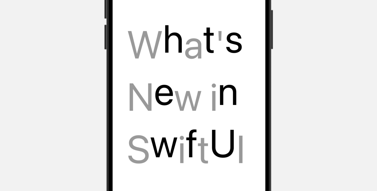
Visual Effects for Text
You can now extend SwiftUI Text views with custom rendering effects by adopting the TextRenderer. Here is a sample text renderer:
struct CustomTextRenderer: TextRenderer {

    func draw(layout: Text.Layout, in context: inout GraphicsContext) {

        for line in layout {
            for (index, slice) in runs.enumerated() {
                context.opacity = (index % 2 == 0) ? 0.4 : 1.0
                context.translateBy(x: 0, y: index % 2 != 0 ? -15 : 15)

                context.draw(slice)
            }
        }
    }
}

struct TextAnimationDemo: View {
    var body: some View {
        Text("What's New in SwiftUI")
            .font(.system(size: 100))
            .textRenderer(CustomTextRenderer())
    }
}
By implementing the draw method, you can customize the visual effect of each character.
Summary
The iOS 18 update introduces a host of significant enhancements to SwiftUI. This tutorial offers a concise introduction to some of the new features. For more complex features, we will be creating detailed, standalone tutorials to thoroughly explore their applications and benefits. Be sure to stay tuned for these upcoming in-depth guides.