In iOS 15, Apple introduced a new way to customize buttons in iOS apps for both SwiftUI and UIKit frameworks. While this tutorial focuses on the new features of SwiftUI, you can refer to this fantastic article, written by Sarun, about how to style UIButton in iOS 15.
Styling a Button in SwiftUI
Before we dive into the new modifiers introduced in iOS 15, let’s revisit how we style a button in the current version of iOS.

Let’s say, we want to create a button with rounded corners, we write the code like this:
Button(action: {}) {
    Text("Buy me a coffee")
}
.padding()
.foregroundColor(.white)
.background(Color.purple)
.clipShape(RoundedRectangle(cornerRadius: 5))
We customize the button’s foreground and background color, apply paddings, and round its corners using the .clipShape modifier.
In iOS 15, to create a similar button with rounded corners, you can use a new modifier called buttonBorderShape and apply a new style called BorderedProminentButtonStyle like this:
Button(action: {}) {
    Text("Buy me a coffee")
}
.tint(.purple)
.buttonStyle(.borderedProminent)
.buttonBorderShape(.roundedRectangle(radius: 5))
.controlSize(.large)
By applying the .borderedProminent style, iOS renders the button with purple background and display the text in white. The .buttonBorderShape modifier lets you set the border shape of the button. Here, we set it to .roundedRectangle to round the button’s corners.
Control Size for Buttons
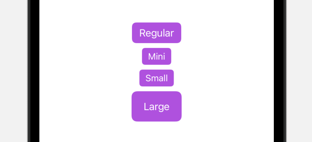
The .controlSize allows you to change the size of the button. The default size is .regular. Other valid values includes .large, .small, and .mini. The figure below shows you how the button looks for different sizes.
Button Border Shape
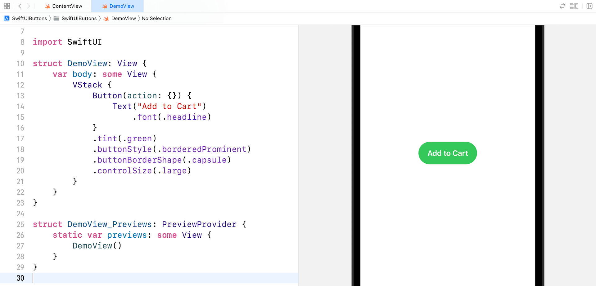
Other than using .roundedRectangle, SwiftUI provides another border shape named .capsule for developers to create a capsule shape button.
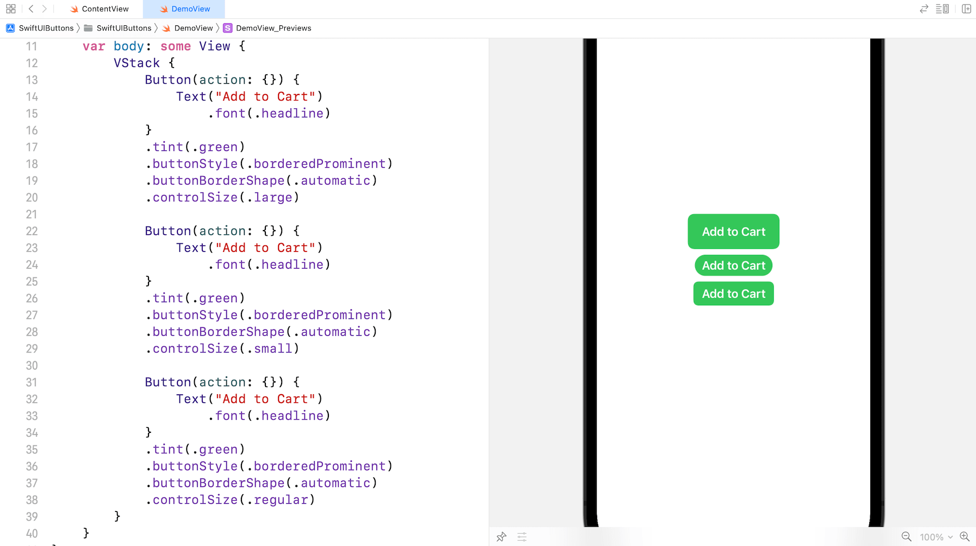
You can also use the .automatic option to let the system adjust the shape of the button.
Changing the Button Style
So far, we use the .borderProminent button style. The new version of SwiftUI provides other built-in styles including .bordered, .borderless, and .plain. The .bordered style is the one you will usually use. The figure below displays a sample button using the .bordered style in both light and dark modes.

Of course, you can create the same button using your own implementation. This new style, introduced in iOS 15, saves you time from writing your own code.
Applying Style to Multiple Buttons
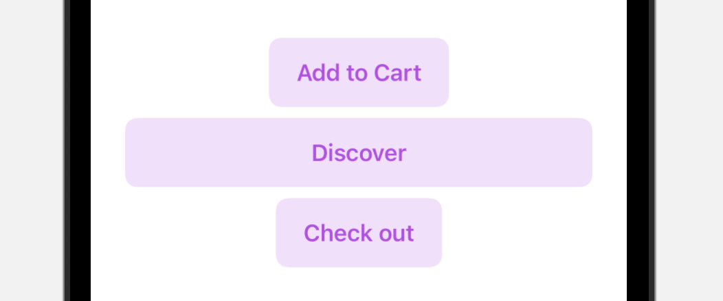
With button style, you can easily apply the same style to a group of buttons. Here is an example:
VStack {
    Button(action: {}) {
        Text("Add to Cart")
            .font(.headline)
    }

    Button(action: {}) {
        Text("Discover")
            .font(.headline)
            .frame(maxWidth: 300)
    }

    Button(action: {}) {
        Text("Check out")
            .font(.headline)
    }
}
.tint(.purple)
.buttonStyle(.bordered)
.controlSize(.large)
Using Button Role
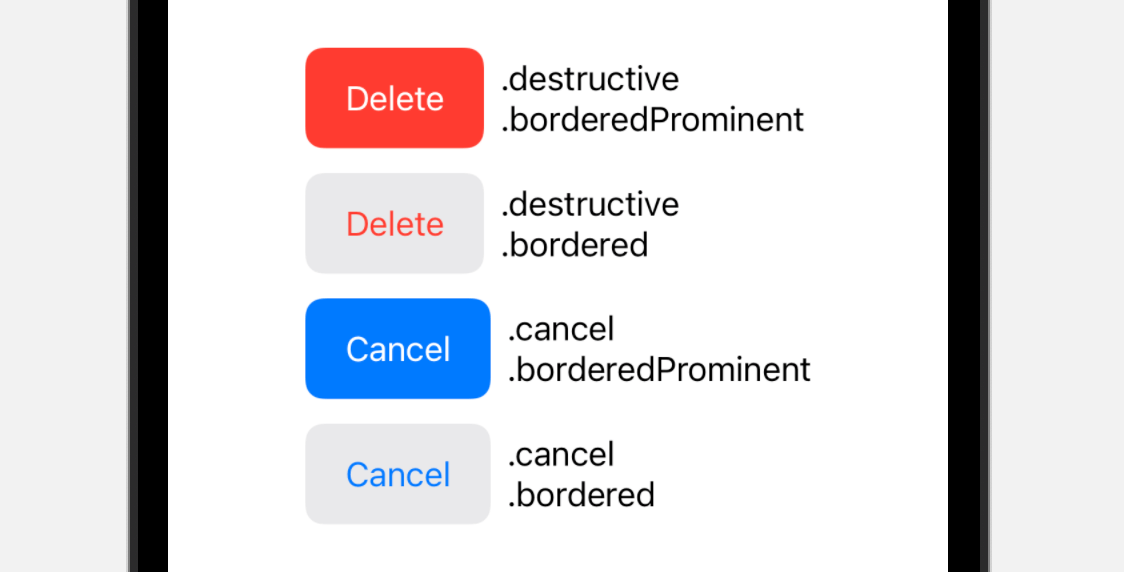
The iOS 15 version of the SwiftUI framework introduces a new role option for Button. This option describes the semantic role of the button. Based on the given role, iOS automatically renders the appropriate look & feel for the button.
For example, if you define the role as .destructive like this:
Button("Delete", role: .destructive) {
    print("Delete")
}
.buttonStyle(.borderedProminent)
.controlSize(.large)
iOS will display the delete button in red automatically. The following figure shows you the appearance of the button for different roles and button styles:
Confirmation Dialog
Other than the new button style, iOS 15 comes with a new modifier called .confirmationDialog that you can attach to a Button for displaying a confirmation dialog.
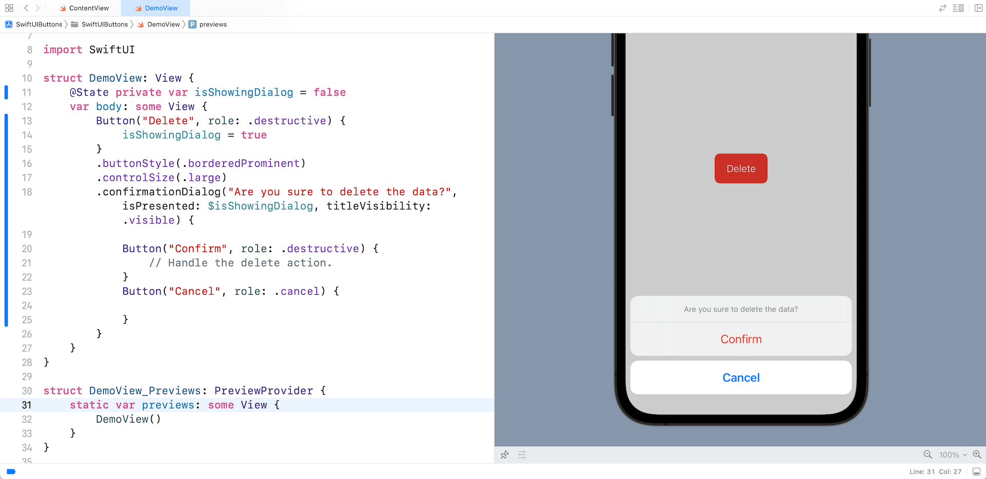
Here is a sample code snippet for presentating the dialog:
struct DemoView: View {
    @State private var isShowingDialog = false
    var body: some View {
        Button("Delete", role: .destructive) {
            isShowingDialog = true
        }
        .buttonStyle(.borderedProminent)
        .controlSize(.large)
        .confirmationDialog("Are you sure to delete the data?", isPresented: $isShowingDialog, titleVisibility: .visible) {

            Button("Confirm", role: .destructive) {
                // Handle the delete action.
            }
            Button("Cancel", role: .cancel) {

            }
        }
    }
}
The .confirmationDialog modifier takes in a title and a binding to a Boolean value that determines whether to present the dialog. Optionally, you can indicate whether the dialog should display the title.
With the code above, the confirmation dialog will be presented like the figure below.
Customizing the Button with Materials
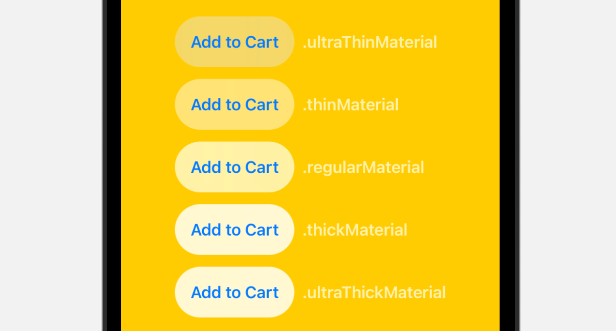
In iOS 15, SwiftUI introduces a material type for developers to create different types of blur effects. You can apply a blur effect to a view that appears behind another view by adding one of the following materials using the .background modifier:
- .ultraThickMaterial
- .thickMaterial
- .regularMaterial
- .thinMaterial
- .ultraThinMaterial
Here is the sample code snippet which applies the .ultraThinMaterial:
Button(action: {}) {
    Text("Add to Cart")
        .font(.headline)
}
.padding()
.background(.ultraThinMaterial, in: Capsule())
As explained by Apple, adding a material is like inserting a translucent layer between the modified view and its background. Depending on the material you use, it will achieve a different blur effect. The following figure demonstrates the blur effect of different materials.
Toggle Button

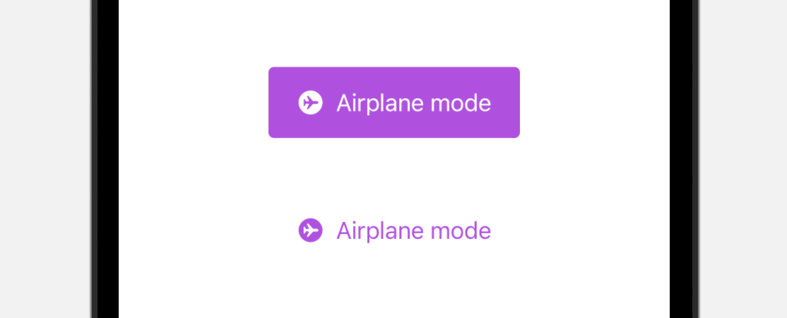
Toggle in iOS appears in the form of switch. In iOS 15, you can configure a toggle to appear like a button by using the .toggleStyle modifier like this:
struct DemoView: View {
    @State private var isEnabled = false

    var body: some View {

        Toggle(isOn: $isEnabled) {
            Label("Airplane mode", systemImage: "airplane.circle.fill")
        }
        .padding()
        .tint(.purple)
        .controlSize(.large)
        .toggleStyle(.button)
    }
}
By setting the toggle style to .button, the toggle appears like a button. The figure below shows how it looks when the toggle is in ON/OFF state.
Summary
iOS 15 brings a number of improvements for customizing SwiftUI buttons. While you can create your own solution to style a button, the new version of SwiftUI makes developers’ job even easier with some built-in styles.
The only downside of all these new features is that you can only use them in iOS 15. If your apps require to support older versions of iOS, you will need to style the button with your own implementation.


