

Apple's engineers may have long recognized the widespread desire among iOS developers to recreate the elegant hero animation featured in the App Store app. Understanding the complexity and time investment typically required to implement such animations from scratch, Apple has incorporated this feature into the iOS 18 SDK.
With this update, you can now achieve a similar animated transition effect in your own apps using just a few lines of code. This significant enhancement empowers developers to create visually appealing and seamless transitions, elevating the overall user experience of their apps.
In this tutorial, we'll explore how to leverage the new NavigationTransition protocol and the matchedTransitionSource modifier to create hero animations during view transitions.
The Simple Demo App
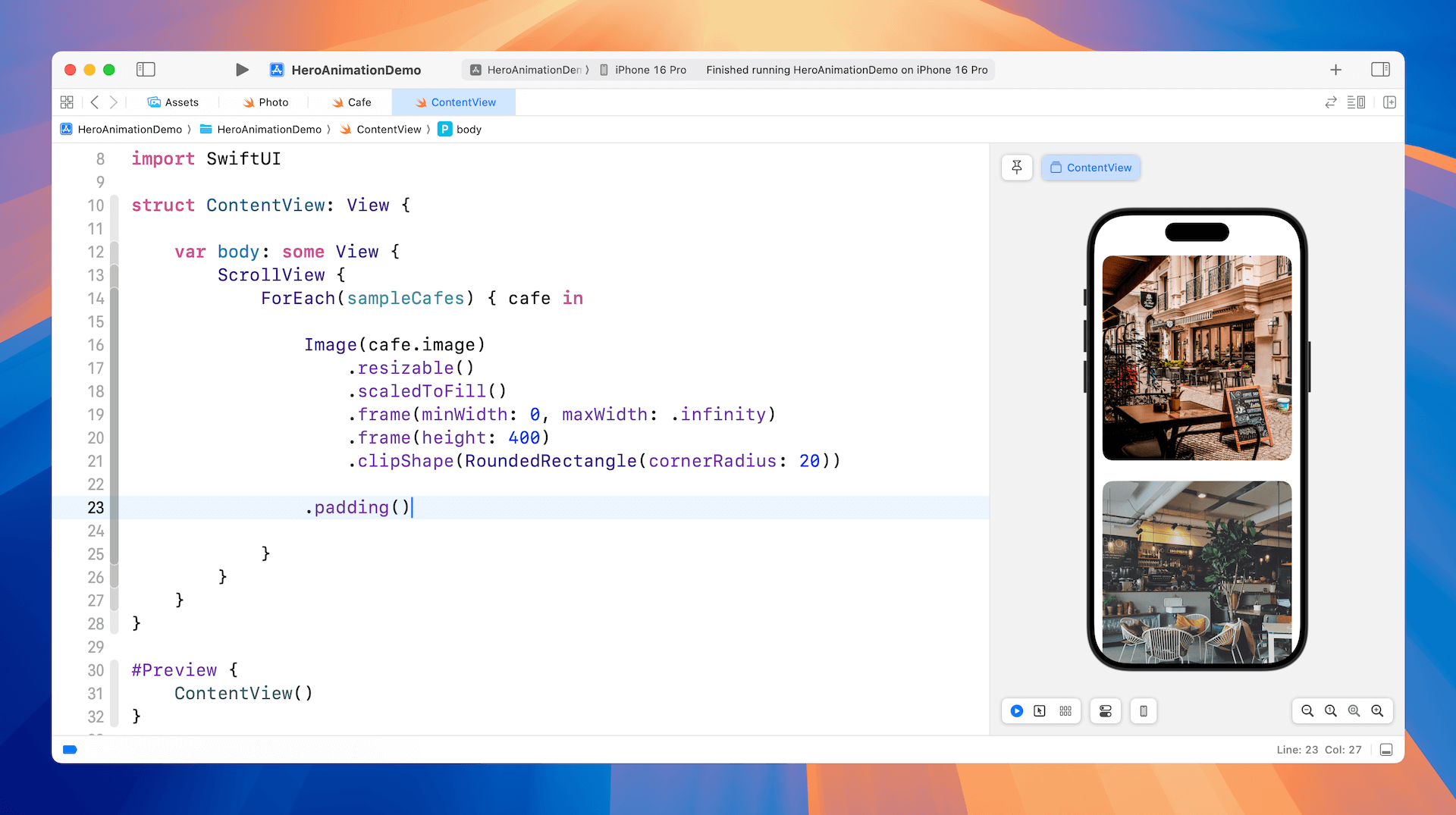
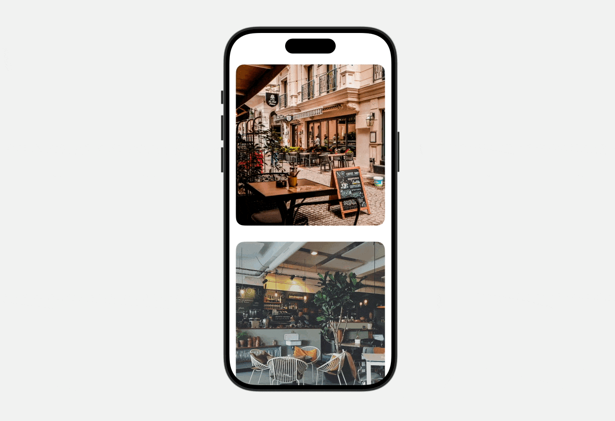
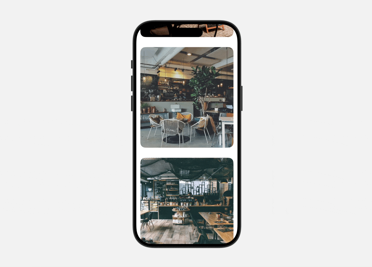
Let's dive into a demo app to explore the new APIs. We'll begin with a simple app that shows a list of cafes in a standard scroll view. Our goal is to implement a feature where tapping on a cafe takes you to a new screen displaying a full image with a hero animation.
Using Navigation Transition Protocol
To display a full image and animate the view transition using hero animations, you can use the following steps:
- Embed the scroll view within a navigation stack.
- Use
NavigationLinkto enable tapping on the card view. - Declare a namespace with
@Namespaceto support the hero animation. - Attach the
matchedTransitionSourcemodifier to the excerpt mode card view. - Attach the
navigationTransitionmodifier to the full content mode card view.
By completing these steps, SwiftUI will automatically generate a smooth hero animation, expanding the selected cafe item into a full-screen image when tapped.
Creating Hero Animations for View Transitions
Now we'll modify the project to support navigation. To start, let's embed the scroll view within a navigation stack, as shown below:
NavigationStack {
	ScrollView {

		// Existing code

	}
}
Next, create the detail view for displaying the full image like below. It accepts a cafe object as input and displays its image in a full-screen view.
struct DetailView: View {
    var cafe: Cafe
    @Environment(\.dismiss) var dismiss

    var body: some View {
        Image(cafe.image)
            .resizable()
            .scaledToFill()
            .frame(minWidth: 0, maxWidth: .infinity)
            .clipped()
            .overlay(alignment: .topTrailing) {
                Button {
                    dismiss()
                } label: {
                    Image(systemName: "xmark.circle.fill")
                        .font(.system(size: 30))
                        .foregroundStyle(Color.white)
                        .opacity(0.7)
                        .padding()
                        .padding(.top, 30)
                }
            }
            .ignoresSafeArea()
    }
}
To enable interaction with the cafe photos, we can use NavigationLink to manage the navigation. When tapped, the app displays the detail view which shows the image in full screen view.
ForEach(sampleCafes) { cafe in

    NavigationLink {
        DetailView(cafe: cafe)

    } label: {
        Image(cafe.image)
            .resizable()
            .scaledToFill()
            .frame(minWidth: 0, maxWidth: .infinity)
            .frame(height: 400)
            .clipShape(RoundedRectangle(cornerRadius: 20))
    }
    .padding()
}
In preview mode, you can navigate between the detail view and the list view. At this stage, the transition uses the default animation for navigation stacks, without any custom effects.
Now it comes to the fun part. Let’s create the hero animation by using the new NavigationTransition protocol. The very first step is to define a namespace for the animation. In ContentView, declare the following namespace variable:
@Namespace var namespaceNext, apply the matchedTransitionSource modifier to the source view, which is the image view in the list. Then, use the navigationTransition modifier on the detail view. Update your code as shown below:
NavigationLink {
    DetailView(cafe: cafe)
        .navigationTransition(.zoom(sourceID: cafe.id, in: namespace))
        .toolbarVisibility(.hidden, for: .navigationBar)

} label: {
    Image(cafe.image)
        .resizable()
        .scaledToFill()
        .frame(minWidth: 0, maxWidth: .infinity)
        .frame(height: 400)
        .clipShape(RoundedRectangle(cornerRadius: 20))
        .matchedTransitionSource(id: cafe.id, in: namespace)
}
To enhance the visual experience, I've included the toolbarVisibility modifier to conceal the navigation bar. This removes the Back button from view, creating a more immersive full-screen presentation of the cafe image.
In preview mode, test the app by tapping a cafe image. It will display a full-screen image with a hero animation. To return to the list, either tap the "X" button or simply drag the image downwards. The app will animate the image back to its original position in the list, providing a fluid and intuitive user experience.
Summary
The new NavigationTransition protocol has made it remarkably simple for developers to create hero animations for view transitions, allowing for a richer user experience with just a few lines of code. Consider exploring this new feature to elevate your app's interactivity and user satisfaction.
It's important to note that this API is only compatible with iOS 18 and later. If your app needs to support older iOS versions, you'll have to implement the animation yourself. Our "Mastering SwiftUI" book provides guidance on how to achieve this.