A few years ago, I was talking to my friend who launched a retail shop selling her own designed bags in a crowded area, she is an enthusiastic entrepreneur who loves her products very much and passionate to share how smart she was to open her first shop in the right area. I was so much inspired. But then she started to share aggressive plans about opening 10 shops in big shopping malls in a year and asked me to invest. Despite my hesitation, I asked her how she planned her new product launches? Why did she choose these malls over other locations? How much did she know about her customers? The answers she gave me were all by her own intuitions and gut feelings. Well, I do agree her products were well designed but the lack of planning and analysis made me feel like crossing streets with blind eyes.
If you have followed the previous article about Search Ads and set up your own ads, you probably have more users downloading your apps. Are you curious to know how users interact with your apps?
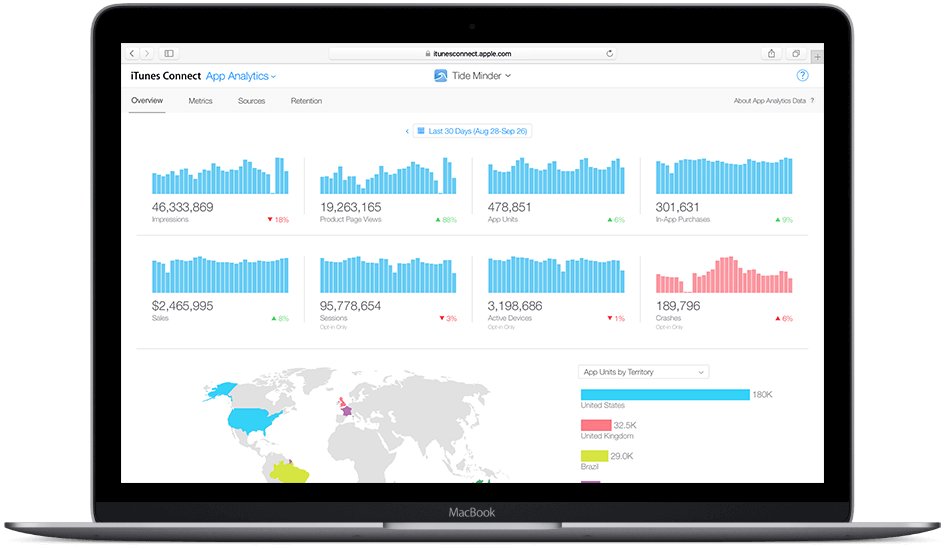
In this article, I am going to walk you through iTunes Connect App Analytics that is available to every Apple Developer who has joined the paid program. It’s a hassle free built-in tool that doesn’t require additional setup and covers all necessary data insights for us to understand more about our users. Reading analytics report is like opening your eyes to see how people interact with your apps. Not only is it important to build beautiful apps, it is crucial for all of us to understand our customers more.
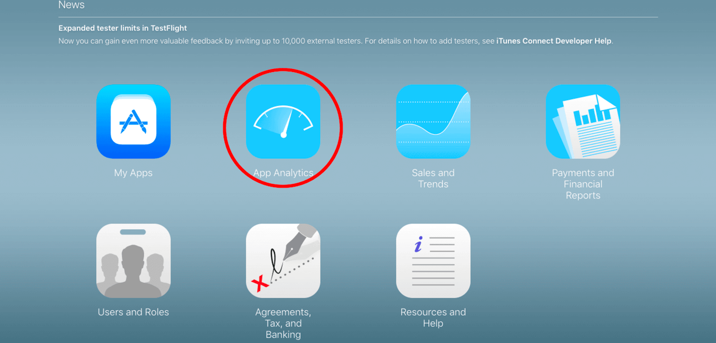
To get started, sign in to your account on iTunes Connect Page, https://itunesconnect.apple.com/ . Once we have entered our account information, we will arrive at the following landing page. Click App Analytics to proceed.
Assuming you already have at least one app available on the App Store, choose an app that you want to analyze. Here I pick English Mock Exam for Cambridge YLE as an example:

For the sake of convenience, all the metrics we are going to mention below are data within the period we set. Say, in this article, we have set to display the data between Aug 01, 2016 — Aug 14, 2017, which can be adjusted by pressing the date range box on the upper right corner.
Then, we land on the Overview page which shows us how our app performs:
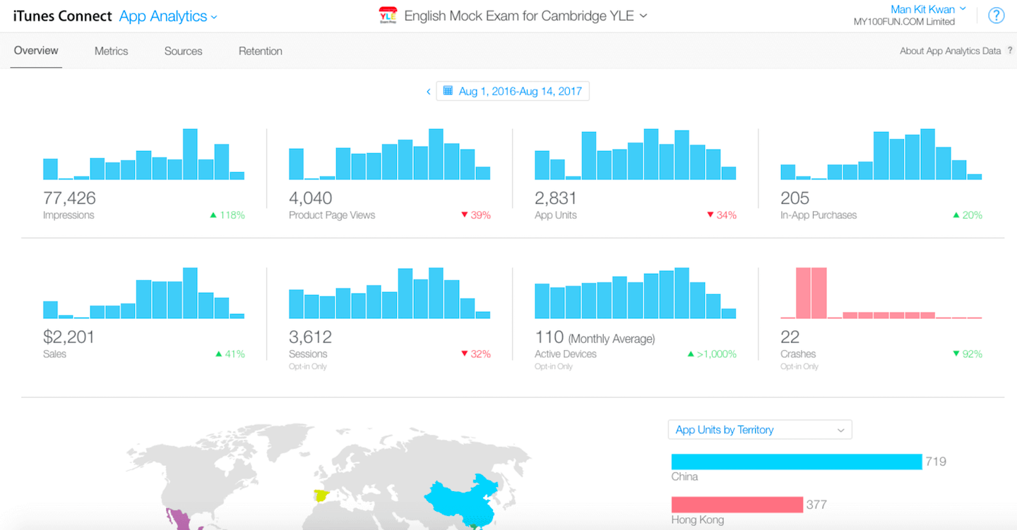
Overview Page shows metrics including Impressions, Product Page Views, App Units, In-App Purchases, Sales, Sessions, Active Devices and Crashes reports (I will go through them one by one with you in the following sections). Then we see a beautiful world map with different colours showing where our app downloaders are. And finally a retention table as well as a pie chart showing different metrics by devices.
In part 1 of the series, we will talk about the Metrics. You will learn Sources and Retention in the next tutorial. Now let’s navigate to Metrics page by clicking the upper bar:

On Metrics Page, we see metrics in three sections, App Store, Sales, and Usage. Let’s go through them one by one:
App Store
Impressions
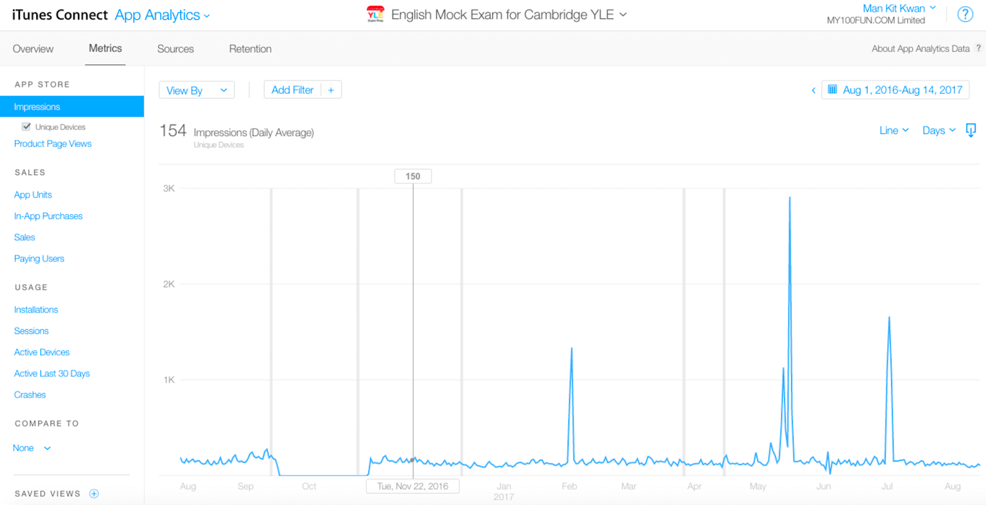
Here, we see a chart that shows all daily impressions activities. Impressions mean the number of times our apps were displayed to users on App Store through browsing or search. One interesting thing about this app is there are some peaks across the year. To be honest, we have not done any advertisement on this app for years. However, such high volume impressions are the reason that our app is being featured by Apple in some countries. (I have tried my best to craft the app as nice as possible and Apple rewarded it!)
Product Page Views
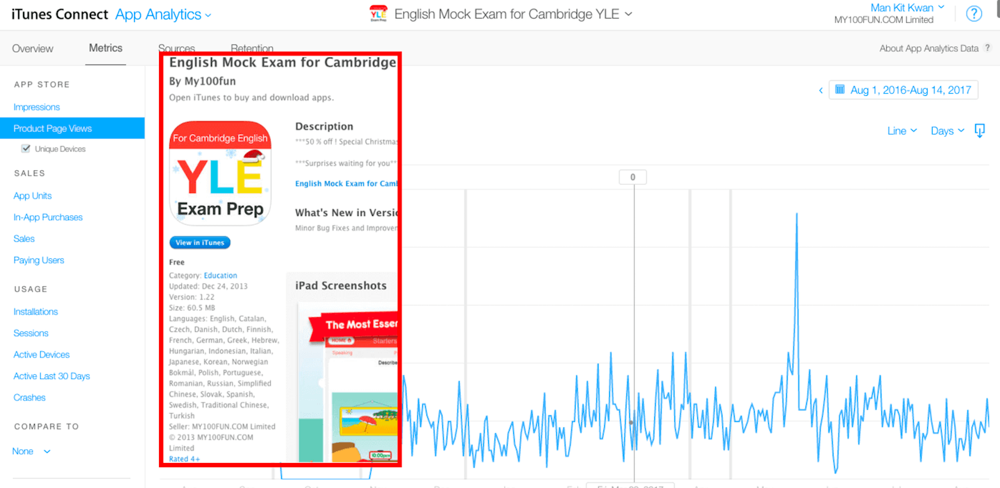
In Product Page Views, it shows how many people tapped into our product page which includes more detailed descriptions and screenshots etc as shown above. This is an important metrics to understand how many potential users have the intention to download our apps – If they are not interested in our app, they won’t click to read more details.
Sales
App Units
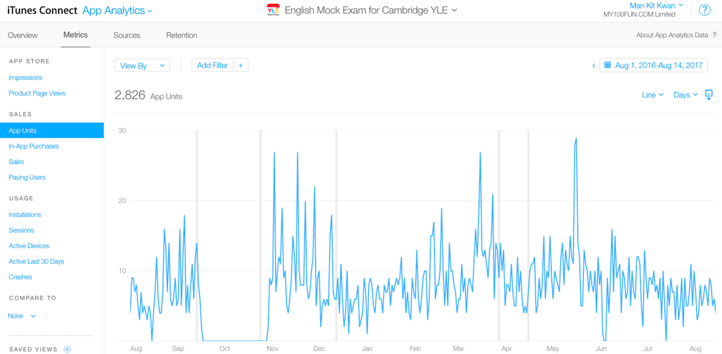
In App Units Page, it shows how many times our app is being downloaded daily (The metric being tracked here is that a user pressed the “Get” or “Buy” button in the app store and that resulted in a download). Comparing the chart showing daily product page views, we find that the pattern is similar, why? Customer behaviour has some sort of pattern: Take this app as an example which has not made any changes or updates for a while, naturally the conversion rate for people who download the app after viewing product page should be similar over time. As an app marketer, our goal is to understand our users, identify potential changes that lead to user growth through experiments and make improvements on conversion rate over time.
In-App Purchases
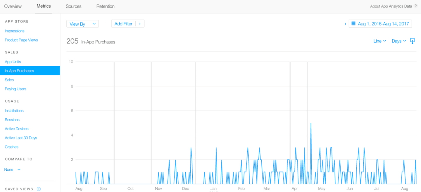
On the In-App Purchases page, the number of people purchased in-app offerings is displayed. It’s a Holy Grail Moment when we see the little blue line come up that shows us that people are paying in our app! On this page, it does not specify which in-app purchase offerings users bought but the total number of purchases every day (in case you have more than one in-app offerings in your app). We will cover more on app Sales and Trend in upcoming tutorials.
Sales
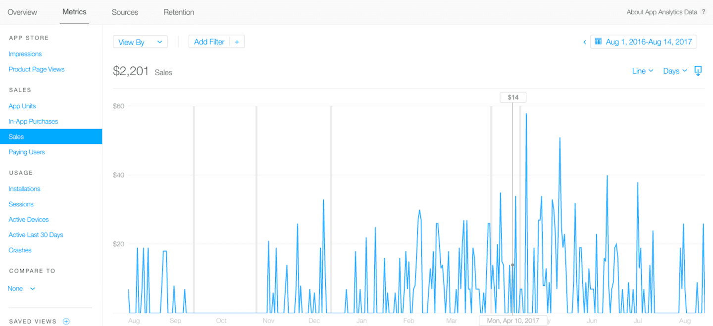
On the Sales Page, it shows the total amount of money we earned. Yes, real cash! But hold on! It’s revenue, not the final proceeds that Apple pays us. Remember Apple takes 30% from every app sales, so the money we are going to get in our pocket is roughly 70% of the sales number shown here.
Paying Users
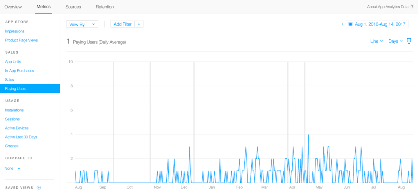
Paying users refer to the number of unique buyers. For example, this app has three offerings: Basic, Intermediate and Advanced level mock exam for kids to work on, some parents (paying users) might buy the whole set of offerings for their kids, which shows only one paying users in this page while having three in-app purchases. By comparing these two sets of data, we can better understand our customer behaviour on buying our offerings: Are users buying our products in bulk or one by one? Should we bundle our offerings?
Usage
Installations
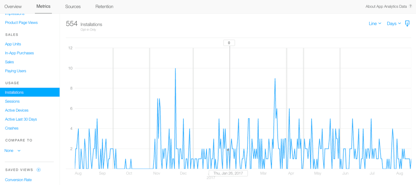
Installation by official definition is the total number of app installations and re-downloads. It sounds like App Units, but the main difference is that an installation is counted when the app is opened for the first time on the device, provided that the device has an active internet connection, and when the app is re-downloaded from the app store.
A common observation is that the Installations data is usually less than App Units. In an ideal world, the ratio of app download and installation should be 1:1. However, several things can affect this ratio. Say, the user has downloaded the app but never open it, or the user does not have an active internet connection.
Sessions
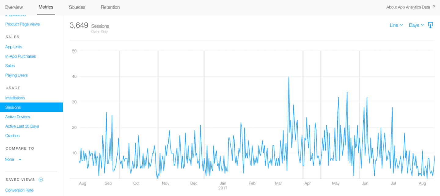
Sessions refer to the number of times the app has been used for at least two seconds. To be more specific, when the app is put in the background and later brought to the foreground again, that will be counted as another session. If you have a background in web development, you will definitely be familiar with this term. For a new learner, sessions is a key insight to understand the in-app usage including how many people are using our apps per single journey.
Let me give you a brief example. Whenever you turn on Evernote app to jot notes and then close the app after finishing the writings, that is a single journey. After few hours, you might want to read the note again, so you open the app and navigate to the note inside an app, then close the app when finish reading. That is considered as another journey. Here iTunes Connect will show 2 sessions in the chart.
This metrics and data show us how active our users use and engage with our app. Obviously, the higher the session values are, the happier we are.
Active Devices
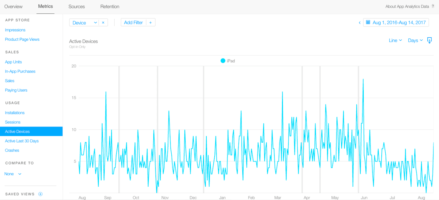
Active Devices is the total number of devices with at least one session.
Active Last 30 Days
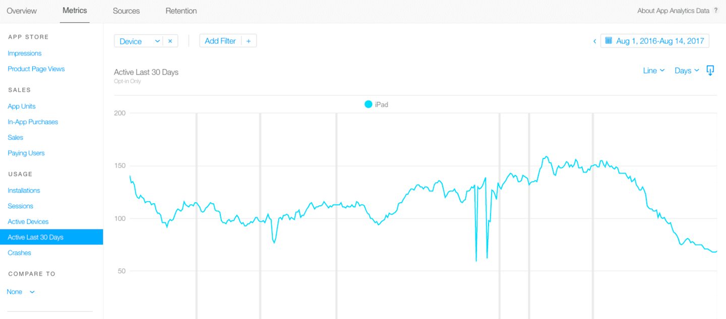
Active Last 30 Days is the total number of devices with at least one session within 30 days based on individual dates. In this page, I recommend you to observe the trend shown on chart-whether it is a rising or falling trend? If it is a rising trend, congratulations and keep up the good works! Try to introduce app refinement and design the app more user friendly, these measures should healthily improve your app engagement with users. If it is a falling trend, it’s about time to make a significant improvement on our app in terms of engagement such as launching app updates, revising app content, or providing interactive platforms.
Crashes
Crash shows us how many times an app crashes. While the actual crash reports are available in Xcode, this page is suitable for people with a non-technical background to monitor whether there are any significant bugs so that we should delay or reshape our app promoting strategy until the problems are fixed.
Compare To
Compare to allows us to compare two set of metrics, just tap on the blue word “None” and choose whatever metrics that compare to the metrics on the current page. On the above metrics introductions I have mentioned few metrics comparisons that will provide extra insights on top of observing single metrics alone. Feel free to try comparing different metrics and if you have any good recommendations on comparing combinations, kindly let me know!
Common Views
Apple has suggested three common views to show insights which most of us would need. The first one is “Conversion Rate”. It is common to see a value around 0.XX, that shows us the ratio of App Units/ Impressions (Daily Average), which means how many people have downloaded our apps when they see the app on App Store. Secondly, it is “New Users per View by Territory”, which the data is sorted by territories to show us how many new users from different countries have downloaded our apps after viewing our product page. And the third one is “Sessions per Active Device by Device”, which shows per person how active they are using our app.
Conclusion
That’s all for iTunes Connect App Analytics Part 1. To recap, we have learned all metrics available on the tool and how to compare them to gain extra insights. In Part 2, I am going to share with you the insights in incoming traffics from different sources as well as user engagement in terms of their app reopening behavior.
If you have used other App Analytics Tools, you might find that the data shown on iTunes Connect App Analytics would be slightly different. It is because iTunes Connect App Analytics only provides data which users agreed to opt-in as to respect their privacy. If you want to know more about other powerful App Analytics Tools such as Mixpanel and Flurry, we will launch advanced tutorials to talk about that later on. As a new comer, iTunes Connect App Analytics is good enough for you to understand more about your customers, and maintain a habit of reviewing data in order to build audience-driven successful apps!


