Apple presents new gadgets every year, and each of this device deserves the attention. But when iPhone X was presented to the public, rules of app designing were changed. With iPhone Xs announcement this year, UI/UX designers had to reconsider their conventional practice concerning design building for iPhones in general. Screen without a traditional Home button that displays the content from one edge to another made a great surprise for everybody.
Editor’s note: Our Swift course has been fully updated to support the latest version of iPhone including iPhone Xs. If you want to learn more about how to design apps for all screen sizes, check out our Swift course for details.
So the goal of UI/UX designers is to create an app for iPhone Xs that will be attractive and simple to use. Of course, specialists need to work for it to create a really amazing design, but there are a few helpful hints that designers should consider when building an app for iPhone Xs. Let’s check these hints out right now!
iPhone Xs Screen Size: Watch The Pixels
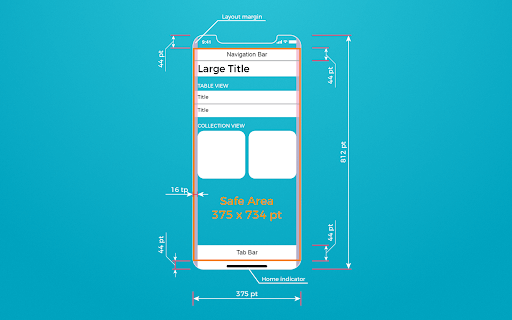
As we noted above, the first modification that affected new iPhone lies in screen size. Edge-to-edge 5.8 inch display is different from the majority of other iPhone models, that is why a new challenge for designers was born. Thus, as a result, it is better to use artboards with 375 x 812 size when you create a design for iPhone Xs apps.
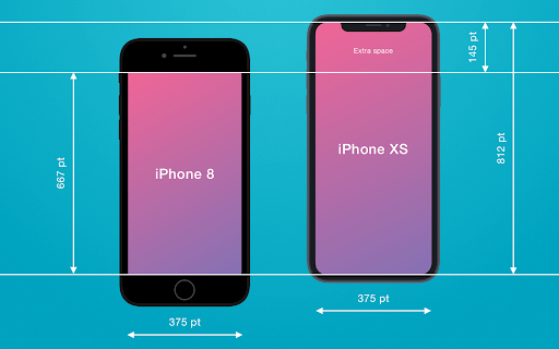
So, now let’s consider step by step how to use iPhone Xs resolution for good.
#1. Reorient elements of UI
On the whole, if we remove bars that are available by default in iPhone Xs screen, we will get about 641 pt of height that gives you more useful space to place your content. Whereas iPhone 8, for example, can offer you only about 560 pt of free space.
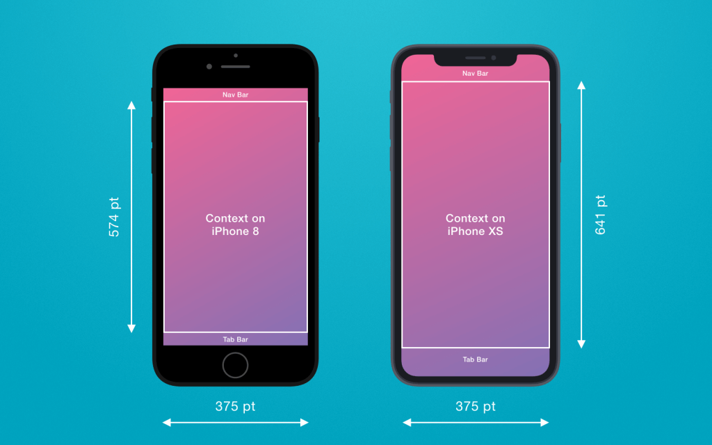
Based on this, reorienting the layout of UI will help you build an amazing design for iPhone Xs. If you don’t keep up with this advice, some UI elements can be located close to notch and it will worsen the overall perception of design.
#2. iPhone Xs notch should be visible
Let’s study the issue regarding iPhone Xs notch more deeply.
The notch in iPhone X and Xs serves also for sensors location, and not everybody adopted this innovation warmly. However, Apple explained why it integrated this thing – more space on the screen, everything is simple. In addition, competitors didn’t offer something better so far.
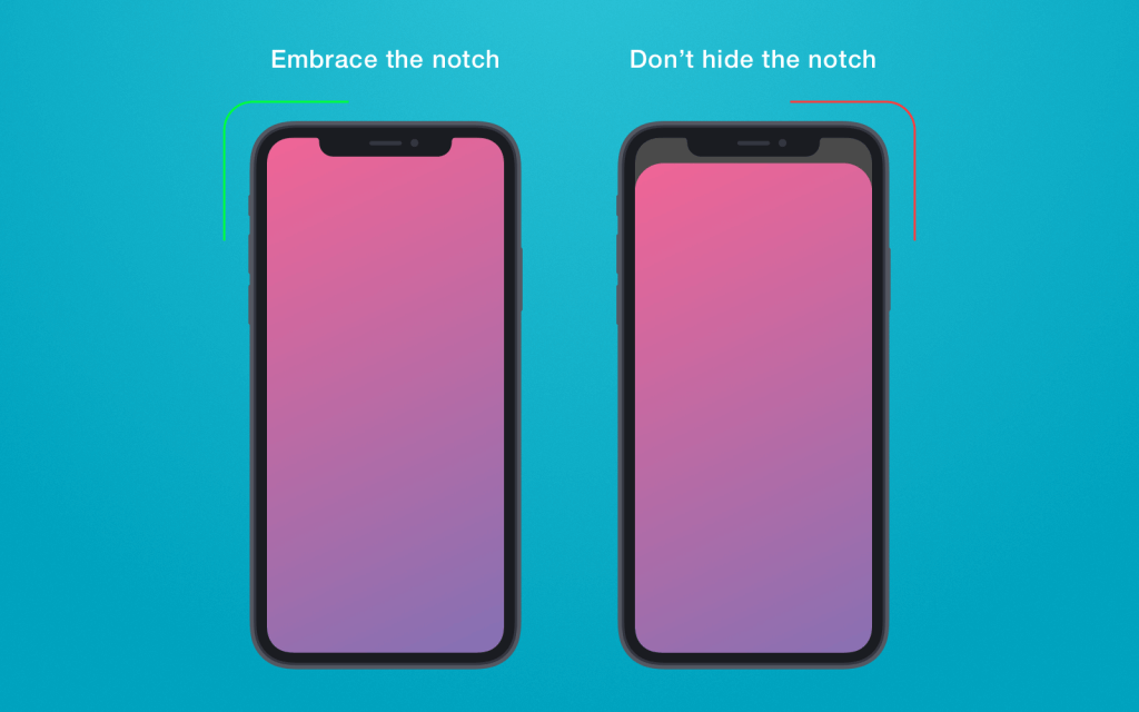
How to use this notch wisely? According to hints from Apple, you should hide this notch with the help of coloring Navigation bar, for example. You’d better leave it and let it be as it is. The matter is that this notch makes it possible to expand the content area visually and give you additional space. Otherwise, if you hide this notch, the app area will also look smaller.
Also, background elements won’t interfere with any app design since they will be held on the corners of the screen.
Apart from this, we recommend you to discuss with your iOS developers the issue concerning the adaptation of the app to new iPhone Xs. All basic UI elements like navigation bars will be aligned automatically. If the app has custom layouts, then mind to use Auto Layout and keep up with safe area guidelines, we will talk about it further.
To see how your app looks like, Xcode simulator can be used, but real devices would be a better option. Real devices will show you the app at its best.
#3. Keep the status bar in mind
In iPhone Xs, status bar changed its size and it is rather taller. So now it is placed in rounded corners on the screen. In Human Interface Guidelines, Apple noted that the height of the status bar isn’t changed when new tasks are launched like maps and so on.
Apple recommends designers to use a native status bar instead of building your custom solutions that can make bar invisible. Why? The point is that users will intuitively look for this bar that should be available in a habitual location. But, anyway, the system offers you three types of status bar, you can choose what you like more.
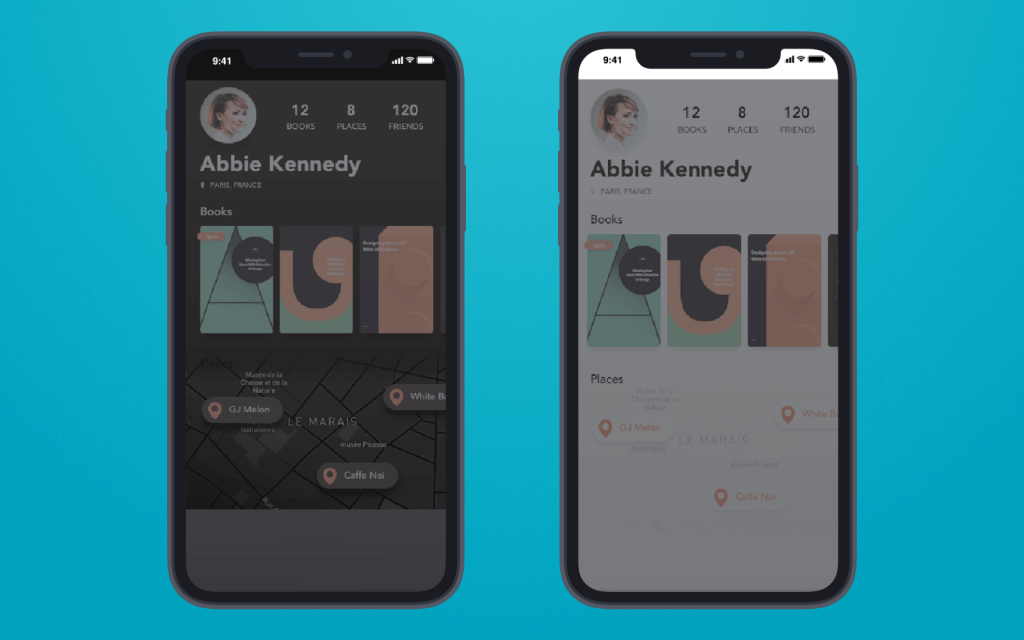
But if you have created your custom bar though, you can change colors for each screen separately or leave it without modifications. This tip can be adopted if you design apps for other iPhone models as well, not only iPhone Xs.
App’s Content Is Important
Size is also important for proper content displaying. So well-thought UI and UX design is the first thing you should take into account. In this section, we will consider ways on how to process content when you design apps for iPhone Xs.
#1. Colors can change everything
Colors can have a serious impact on the overall app design, so we recommend you adhere to Apple’s instructions. They offer designers to use P3 color instead of sRGB colors during the design building for iPhone Xs (or iPhone X).
It will help your app embrace more space and give users a wider colors’ spectrum. With the help of P3 colors, it is possible to export assets at 16-bit PNG.
Mind that only Photoshop can help you to implement this task while Sketch lacks this option.
Also, consider that outdated displays will not let you create such colorful design since they simply cannot process so many colors. Keep this fact in mind when you plan to build app design for iPhone Xs. So your iMac should be not older than the 2015 year of issue.
#2. iPhone Xs ratio should be considered
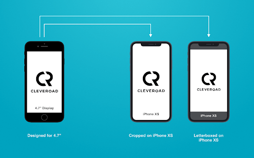
An aspect ratio of iPhone Xs is different from other models, it is taller. Thus, it doesn’t mean that any good-looking content from iPhone 7, for example, will be so attractive on iPhone Xs as well. Content can be simply cropped.
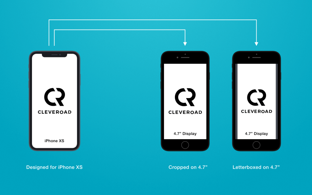
A second example – if you launch the content from iPhone Xs on other models with a 4.7-inch screen, content can be pillarboxed. That is why it is necessary to test everything on different aspect ratios to make sure that design looks perfect.
#3. Deal with new screen shape
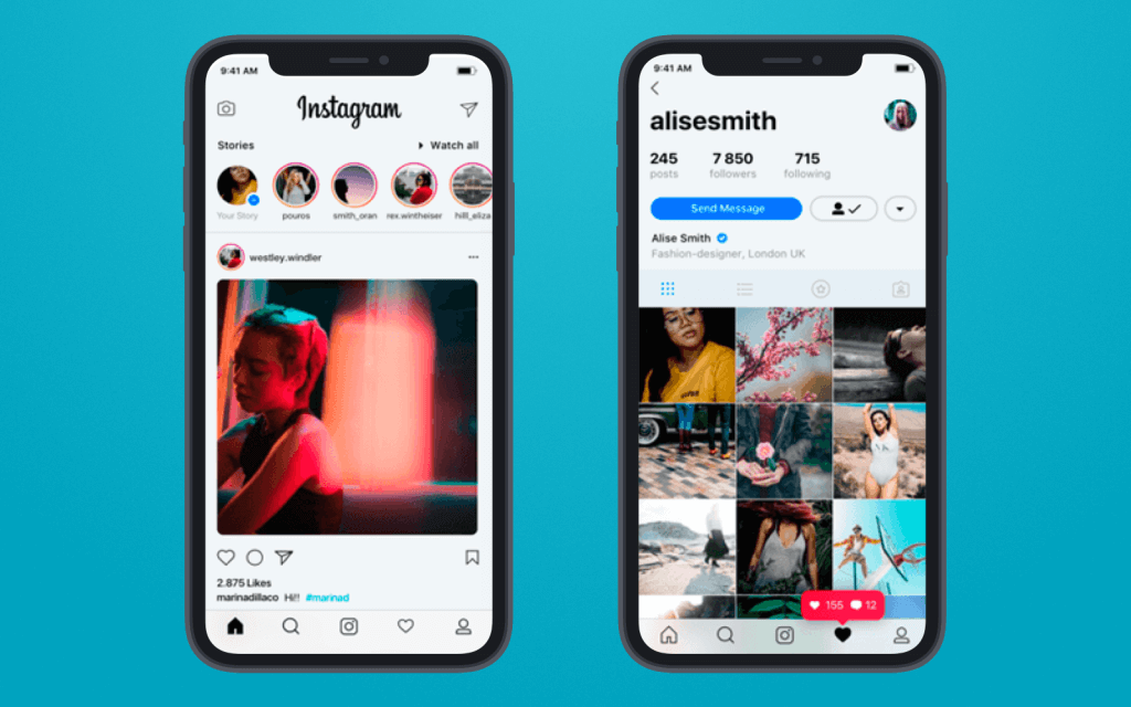
Of course, new screen size and rounded corners may push away many users, and innovation may seem something useless and unclear. But in fact, it gives people a brand new experience. That is why you should show users that an innovative screen design can bring user experience to a new level.
Mind To Keep With iPhone Xs Design Guidelines
So as to avoid unwanted problems with the content when designing apps for iPhone Xs, you are highly recommended to get acquainted with Safe area guidelines that you can find on Apple’s official website. In these guidelines, you will be able to find all necessary instructions that will help you create high-quality apps and place content in a proper way. Let’s study some of them!
#1. Landscape mode in iPhone Xs
Landscape mode in iPhone Xs makes it possible to hide the status bar so it gives more space for the app content. In addition, other bars become smaller.
Of course, not all apps may require the usage of this mode, however, there is a large number of possible use cases of it. Viewing photos, videos, and other types of content will be very good in landscape mode. Landscape mode can be switched to portrait mode easily when users need it.
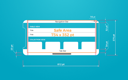
Even if you think that your app doesn’t need it, adaptation to the landscape mode can be beneficial for your app, keep it in mind.
#2. Think about the website
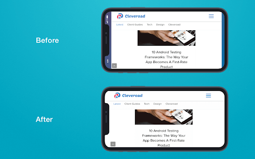
It is quite possible that you may create a design not only for the app but also for websites, so you will have both app and website version. Safe area guidelines will help you adapt website for iPhone Xs, so your web content will be displayed in a proper way on a smartphone screen.
Wrapping Up
Well, that is everything we would like to share with you in this tutorial. We hope that it will be practical and useful for you. Considering that app design for iPhone Xs requires a lot of nuances to be taken into account, you should be very attentive in order to create a really amazing app. Using our tutorial, this task will be much easier. So be clever, and follow the right road!
This is a guest post by Nataliia Kharchenko, Technical Writer at Cleveroad company.
About the Author: Nataliia Kharchenko is a Technical Writer at Cleveroad company that offers web and mobile app development solutions. They are focused on helping startups, small, and medium businesses create competitive and winning software. She enjoys bringing a digital world closer to people and writing about technology, mobile apps, innovations, and progressive management models.


