By the time SwiftUI was announced and given to developers in WWDC 2019, it was made obvious that this was going to be the future for developing applications for all Apple devices. However, even though SwiftUI might be the framework that will dominate on UI creation sooner or later, UIKit is still here, and WWDC 2020 came to prove that with some great additions and improvements announced this year.
Most of those improvements took place for making it easier to port iPadOS apps to macOS and achieve the maximum possible compatibility. That doesn’t mean though that they can’t be used in apps targeted for iOS or iPadOS only. But besides that, I believe there’s a conclusion that everyone ends up with after studying these improvements; they are features that should have been made available years ago. For example, it’s now possible to use a UIAction in order to set the action of a UIButton (and other controls), instead of specifying a separate action method. In projects with lot of code, this could save enough lines and time to developers.
It also seems that special care was given to pickers, with a brand new picker being available starting from iOS 14; the color picker. It resembles the color picker we find on macOS, and it provides a variety of methods for selecting a color. It even has an eyedropper tool in order to pick a color from the displayed content on screen. But that’s not the only one. Date picker has been improved as well, with the traditional wheels becoming optional and two more appearance modes becoming available; compact for limited space areas, and inline for presenting a full calendar within a view.
There’s also another new feature that people will appreciate a lot. That is the capability to present menus either on touch down or by long pressing on UIButtons and UIBarButtonItems. They’re great for providing users with options or secondary actions when interacting with these controls. The cherry on the cake is that menu items can be static, or be loaded asynchronously.
All the above consist of an outline of what we’re going to talk about in this post. To summarize our roadmap, we’ll start with the color picker and then we’ll continue by meeting the new modes of the date picker. After that, we’ll dive into the menus presentation, and we’ll finally close the post with improvements in UIActions and where these can be used.
The Demo App
Before we explore all that, there’s a starter project to get first. The sample application contained is a tab bar application, but without any specific functionality. Tabs are there to separate the topics that we’ll talk about, with a view controller matching to a topic.
So, the first one is the ColorPickerViewController which we’ll use to demonstrate the brand new color picker. There’s a view added to the view controller’s view, which will update its background color according to the color we pick.
Then it’s the DatePickerViewController where we’ll meet the improvements made to the date picker. Using a segmented control we’ll make it possible to switch from one appearance to another and we’ll talk about the possible configuration that can be done.
The third one is the MenusViewController. This is the part where we’ll discuss about how to present menus when tapping either in UIButtons or in UIBarButtonItems, and on top of that we’ll also see how to make menu items to be loaded asynchronously.
Finally, it’s the ActionsViewController; the place where we’ll learn about new controls that UIActions can be used with, and we’ll put some of them in motion.
Before we move on, you’ll notice that various parts of the demo project have already been implemented. They’re all about stuff that we don’t need to focus on, such as setting auto layout constraints, so UIKit advancements is purely the topic of each part.
The Color Picker View Controller
We are starting our exploration to the new UIKit additions and improvements with the color picker; a brand new view controller included in the iOS 14 SDK. Programmatically it’s represented by the UIColorPickerViewController class, instances of which can be presented by any other view controller that need to display the color picker to users.
Initializing and presenting the color picker view controller, and then getting back a selected color, is one of the simplest and most straightforward processes one can find when programming for iOS. And in fact, we’re going to go through it right here. It was already described in the previous part that the demo project contains a view controller called ColorPickerViewController, which is the place where we’ll configure and trigger the presentation of the color picker view controller.
In the Main.storyboard file and in the view controller’s scene you’ll find a view object (UIView) and a button on the view’s bottom side. The button’s purpose is to present the color picker view controller. The view will be showing the selected color in the picker as its background color. The view has already been connected to an IBOutlet property, and the button to the pickColor(_:) IBAction in the ColorPickerViewController class.
After that short description let’s present the color picker. Go to the ColorPickerViewController.swift file, in the pickColor(_:) IBAction method. The first step is to initialize a UIColorPickerViewController object:
let picker = UIColorPickerViewController()Before we present it, we can pass a color object (UIColor) to be displayed by default. UIColorPickerViewController provides the selectedColor property for that, and here we’ll pass the current background color of the view to it. Note that the background color is an optional value, but the selectedColor property expects for an unwrapped color object. In that case, we’ll provide a default color using the nil coalescing operator in case the view’s background color is nil.
picker.selectedColor = colorSampleView.backgroundColor ?? UIColor.blackThere’s one more necessary step before we present the color picker; that is to set our view controller as the delegate of the color picker and get any selected color back, as well as to be notified when the color picker is dismissed. So:
picker.delegate = selfFinally, we can present it:
self.present(picker, animated: true, completion: nil)Here’s the pickColor(_:) IBAction method complete:
@IBAction func pickColor(_ sender: Any) {
    let picker = UIColorPickerViewController()
    picker.delegate = self
    picker.selectedColor = colorSampleView.backgroundColor ?? UIColor.black
    self.present(picker, animated: true, completion: nil)
}
At this point you’ll see that Xcode shows an error message in the line where we’re setting self as the delegate of the picker. We haven’t implemented the required methods required by the UIColorPickerViewControllerDelegate protocol. To do that, go after the closing of the ColorPickerViewController class and add the following extension:
extension ColorPickerViewController: UIColorPickerViewControllerDelegate {

}
The first delegate method we need to implement is the one that gives us the selected color. See that the method’s argument is the color picker view controller instance, and through that we can access the selectedColor property and do anything we want with it. Here, we’ll simply update the background color of the colorSampleView:
func colorPickerViewControllerDidSelectColor(_ viewController: UIColorPickerViewController) {
    colorSampleView.backgroundColor = viewController.selectedColor
}
Optionally, we can also dismiss the view controller by adding the following line:
viewController.dismiss(animated: true, completion: nil)Note that the above will make the color picker go away every time a color is selected, and that might not always be a desired behaviour as users won’t be able to tap on different colors subsequently. Use it or not depending on the needs of the app you’re making.
The next delegate method can be used to let the presenting view controller know when the color picker has been dismissed. There’s nothing particular to do here, so leaving it empty is just fine. However, if you want to trigger further actions when the picker is dismissed, this is the place to do so.
func colorPickerViewControllerDidFinish(_ viewController: UIColorPickerViewController) {

}
Run the demo app to the Simulator or on a device to see the color picker for first time. Once the app is running, click on the Select Another Color button to present it:
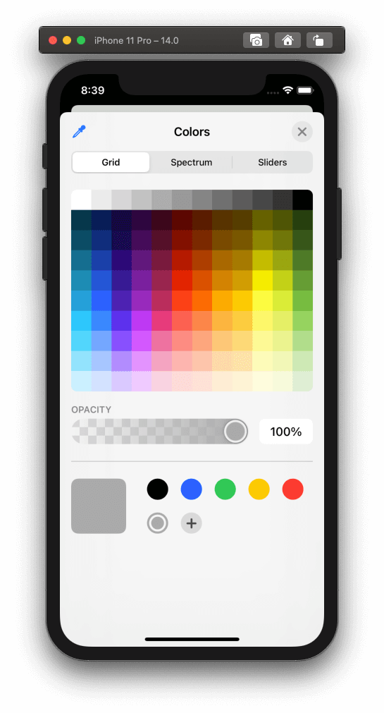
The first view that shows up and allows to select colors from is a grid, with a range of colors being available as shown in the above image. Write below there’s a control to change the opacity (alpha value) of the color, and after that there’s an area where users can add favorite colors that use often. Also notice that next to the favorite colors there’s the default color that we specified through the selectedColor property.
There are two additional ways to pick a color besides the grid. The first one is through the gradient color spectrum which is shown by tapping on the respective segment:
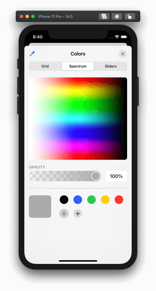
The other way is by using RGB (red, green, blue) sliders in order to provide an exact RGB value, and on top of that there’s also a field where a color can be given as a hexadecimal value. It’s also possible to change the default color space by tapping on the Display P3 Hex Color button:

But that’s not only! If you look at the top bar you’ll see an eyedropper tool button on the left. When clicked, the color picker is temporarily dismissed, and it’s given the capability to select a color from the displayed screen content. Once selected, that color is then shown to the color picker. Interesting feature, especially on iPad.
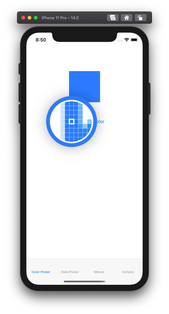
Once you explore the color picker, select any color you’d like to see as the background color of the colorSampleView. If you haven’t added the line to dismiss it in the colorPickerViewControllerDidSelectColor(_:) delegate method as it was discussed previously, then you have to tap on the close button to manually dismiss it after selecting a color. Regardless of that, the selected color will be applied in the sample view.
It won’t be always desirable to let users change the color opacity (alpha value) when using the picker, and you might want to prevent them from doing so in certain cases. For that purpose, it’s possible to initialize and present the color picker view controller so it doesn’t display the controls to change the opacity.
Back in Xcode, you can do that if you set the supportsAlpha property to false while initializing the color picker instance:
@IBAction func pickColor(_ sender: Any) {
    let picker = UIColorPickerViewController()
    ...

    picker.supportsAlpha = false

    self.present(picker, animated: true, completion: nil)
}
Run the app again, and this time notice that there’s no way to change the alpha value of the selected color.
The Date Picker
Date picker is not new in iOS; who does not know the famous wheels control that allows to pick a date or time by spinning it?
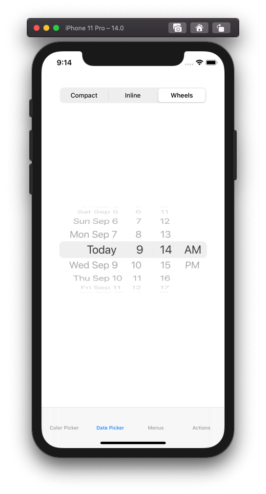
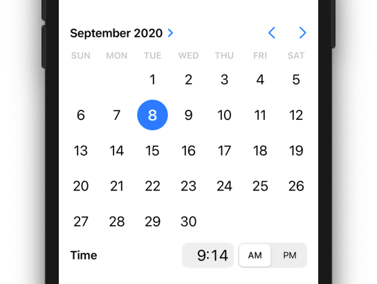
What’s new in date picker though is that it comes with two new, additional display options: compact and inline. Both of them can display both date and time, or just either date or time. Compact style is suitable for areas with limited space where anything else wouldn’t fit, such as a table view cell, while inline style is perfect to display a full sized calendar when there’s available space.
We’re going to meet those new styles, so open the DatePickerViewController.swift file in Xcode. You’ll notice that a date picker has been declared as a property, so let’s go ahead to initialize and configure it. We’ll do that in a new method which we’ll call showDatePicker():
func showDatePicker() {

}
We’ll start by initializing the date picker and providing the current date. At the same time, we’ll specify current locale as the one to be used so it displays the date and time correctly:
datePicker = UIDatePicker()
datePicker?.date = Date()
datePicker?.locale = .current
Then, and that’s the interesting part, we’ll specify the preferred style; compact, inline, or wheels. We’ll set the compact style here, though we’ll make it possible to change it in a while:
datePicker?.preferredDatePickerStyle = .compactFinally, let’s set a target method to be called every time a date or time is selected. This is the handleDateSelection() method which already exists in the DatePickerViewController class.
datePicker?.addTarget(self, action: #selector(handleDateSelection), for: .valueChanged)Notice that the valueChanged event is the one that triggers the call of the handleDateSelection() method. There’s nothing in particular we need to do when a date is selected here, for that reason handleDateSelection() just prints the selected date on the console.
Finally, there is one last step, not directly related to date picker’s configuration, but to how it’ll be displayed on screen. We must add it as a subview to view controller’s view and set its layout constraints. To do that, just call the addDatePickerAsSubview() method, which already exists implemented. This in turn will call the updateDatePickerConstraints() which will set the auto layout constraints depending on the date picker’s style.
The entire showDatePicker() method is this:
func showDatePicker() {
    datePicker = UIDatePicker()
    datePicker?.date = Date()
    datePicker?.locale = .current
    datePicker?.preferredDatePickerStyle = .compact
    datePicker?.addTarget(self, action: #selector(handleDateSelection), for: .valueChanged)
    addDatePickerAsSubview()
}
By default a date picker control displays both date and time. You can change that by setting the proper value to the datePickerMode property of the date picker object. For example, the following makes the date picker display only the date:
datePicker?.datePickerMode = .dateBefore we run the app, it’s necessary to call the showDatePicker() method. We’ll do that in the viewDidLoad(_:):
override func viewWillAppear(_ animated: Bool) {
    ...

    showDatePicker()
}
Run the demo app now and open the second tab that will load and show the date picker view controller. You will see the default, compact style we set to the date picker:

By tapping or clicking either on the time or date part, a full sized picker is presented automatically in order to choose a new date or time value. After having selected one, tap anywhere out of the date picker to dismiss it.
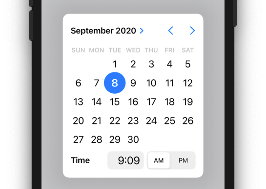
Notice that there’s a segmented control at the top side of the view controller. It has been placed there in order to let us switch among all available styles of the date picker, however it’s not working yet. Let’s fix that now.
Return to Xcode and find the updateDatePicker(_:) IBAction method in the DatePickerViewController.swift source file. Using a switch statement we’ll set the appropriate style to the date picker, depending on the currently selected segment index. At the end, we’ll call the updateDatePickerConstraints() method to set the proper auto layout constraints for the selected style. Here it is:
@IBAction func updateDatePicker(_ sender: Any) {
    guard let segmentedControl = sender as? UISegmentedControl else { return }

    switch segmentedControl.selectedSegmentIndex {
        case 0: datePicker?.preferredDatePickerStyle = .compact
        case 1: datePicker?.preferredDatePickerStyle = .inline
        case 2: datePicker?.preferredDatePickerStyle = .wheels
        default: break
    }

    updateDatePickerConstraints()
}
You can run the app again and tap on the segments. Date picker will be displayed using the respective style each time. Here’s the inline style of it:
Displaying Menus
I’ll start this part by citing the exact words we heard in WWDC 2020, session 10052:
iOS 14 brings quick, lightweight interactions with menus to more parts of your UI.
As you’ll see right next, adding menus (UIMenu objects) to buttons and bar button items is an easy and fast task. Users can have additional options at their disposal simply by single tapping or long pressing either on a button or a bar button item, experiencing a smooth, animated appearance and disappearance of menus.
Displaying Menus From A Bar Button Item
Let’s start our hands-on discussion by presenting a menu to a bar button item first. We’ll talk about buttons right after, and on top of that we’ll also see some additional interesting details.
Our target view controller this time is the MenusViewController implemented in the respective file in the starter project you downloaded. This view controller is embedded into a navigation controller so we have a navigation bar, and it contains a bar button item which has already been connected to the actionItem IBOutlet property and the handleActionItemTap(_:) IBAction method.
There are also two more buttons that we’ll deal with later; for now both of them are hidden as you can see in the viewWillAppear(_:) method in the MenusViewController class.
The handleActionItemTap(_:) IBAction method contains a simple implementation; it presents an alert with a dummy message when the bar button item is tapped. You can actually run the app, open the Menus tab and then tap on the bar button item to present that alert.
Our first goal here is to present a menu when that bar button item is long pressed. For that reason, let’s define a new method in the MenusViewController class:
func configureActionItemMenu() {

}
First, we’ll create three sample UIActions so we have options to provide the actual menu with later. Each action will have a title and an image; we’ll use symbol images that can be found in the SFSymbols app by Apple. Just for the sake of the example, we’ll mark the last action as desctructive, and the system will present it with a red color to attract attention to it. As for the actual actions, there’s nothing we’ll do for real. We’ll simply print messages on the console.
Here they are:
let add = UIAction(title: "Add new...", image: UIImage(systemName: "plus.circle")) { (action) in
    print("Add new action was selected")
}
let edit = UIAction(title: "Edit", image: UIImage(systemName: "pencil.circle")) { (action) in
    print("Edit action was selected")
}
let delete = UIAction(title: "Delete", image: UIImage(systemName: "minus.circle"), attributes: .destructive) { (action) in
    print("Delete action was selected")
}
Now, let’s create a UIMenu object which we’ll provide a title with, and of course, the above actions:
let menu = UIMenu(title: "Actions", children: [add, edit, delete])Finally, let’s add that menu to the bar button item. To do that, there’s a property called menu; we’ll assign our menu to it:
actionItem.menu = menuThe configureActionItemMenu() method is ready:
func configureActionItemMenu() {
    let add = UIAction(title: "Add new...", image: UIImage(systemName: "plus.circle")) { (action) in
        print("Add new action was selected")
    }
    let edit = UIAction(title: "Edit", image: UIImage(systemName: "pencil.circle")) { (action) in
        print("Edit action was selected")
    }
    let delete = UIAction(title: "Delete", image: UIImage(systemName: "minus.circle"), attributes: .destructive) { (action) in
        print("Delete action was selected")
    }

    let menu = UIMenu(title: "Actions", children: [add, edit, delete])
    actionItem.menu = menu
}
This method must be called somewhere, so go to the viewWillAppear(_:) and add this:
override func viewWillAppear(_ animated: Bool) {
    ...

    configureActionItemMenu()
}
Run the app again and make a long press on the bar button item; you should see the menu showing up, and if you tap on any action you’ll see the respective message appearing on the console.
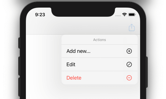
In case you’re aiming in providing such functionality in your apps, then that’s all you need to know! However, there will be cases where you’ll need to present the menu right when the bar button item is tapped, on touch down. This can be achieved easily by doing the following:
Don’t assign a primary action to the bar button item!
Right now the bar button item is connected to the handleActionItemTap(_:) IBAction method, and this is its primary action. If you delete that connection, or if you don’t provide any such action at all in the first place, the menu will appear instantly on touch down.
To see that happening, open the Main.storyboard file and spot the MenusViewController scene in the canvas. Select the bar button item and right click on it so the black context menu appears. Under the Sent Actions section there’s the connected action method; delete it!
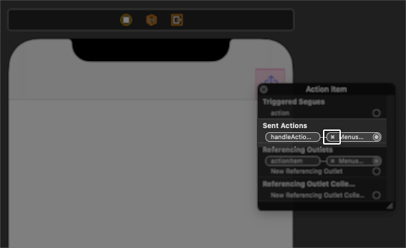
Now run again and tap just once on the bar button item. The alert won’t show up this time, but the menu will be instantly presented!
Displaying Menu From A Button
By default, a button (UIButton object) can present a menu that is added to it by making a long press. However, the way to change that and present the menu instead of performing the button’s default action has a different approach comparing to what we just met.
Before we see that, let’s start in a similar way as before, and let’s create a menu to add to the Tap Me button in MenusViewController. In the MenusViewController.swift file go to viewWillAppear(_:) method and comment out the following line:
tapMeButton.isHidden = trueThe above will make the Tap Me button be visible in the view controller’s view. This button is already connected to the tapMeButton IBOutlet property, and to the handleTapMeButtonTap(_:) IBAction method. As it happened previously, the button is displaying an alert when it’s tapped. Feel free to run the app to see it working if you want.
Let’s move on by creating a new menu and adding it to the button. The process is exactly the same as shown before, so first we have to define the menu actions and then use them in the initialization of a UIMenu object. We’ll do all that in a brand new method:
func configureTapMeButtonMenu() {
    let option1 = UIAction(title: "Option 1") { (action) in
        print("Option 1 was selected")
    }
    let option2 = UIAction(title: "Option 2") { (action) in
        print("Option 2 was selected")
    }
    let option3 = UIAction(title: "Option 3") { (action) in
        print("Option 3 was selected")
    }

    let menu = UIMenu(title: "Your options...", children: [option1, option2, option3])
}
UIButton has a menu property just like the UIBarButtonItem, so all we have to do is to assign the above menu to that property:
func configureTapMeButtonMenu() {
    ...

    tapMeButton.menu = menu
}
Note: We could make our code shorter by defining the UIActions inline in the UIMenu initialization both here and in the previous part, however we’d lose in readability and that’s not something we want during a learning process; things must be simple to comprehend. However, just for demonstration reasons, here’s the shorter version the above:
func configureTapMeButtonMenu() {
    tapMeButton.menu = UIMenu(title: "Your options...", children: [UIAction(title: "Option 1", handler: { (action) in
        print("Option 1 was selected")
    }), UIAction(title: "Option 2", handler: { (action) in
        print("Option 2 was selected")
    }), UIAction(title: "Option 3", handler: { (action) in
        print("Option 3 was selected")
    })])
}
So, with the configureTapMeButtonMenu() implemented, all we’ve left to do is to call it; in the viewWillAppear(_:) add this:
override func viewWillAppear(_ animated: Bool) {
    ...

    configureTapMeButtonMenu()
}
Running the app again and long pressing on the Tap Me button will display the menu:
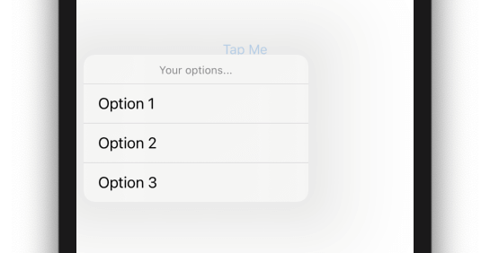
On the contrary to the bar button item, this time isn’t necessary to delete the button’s primary action in order to present the menu on touch down. We can achieve it by setting true to a UIButton’s property called showsMenuAsPrimaryAction.
Update the configureTapMeButtonMenu() method with this:
func configureTapMeButtonMenu() {
    ...

    tapMeButton.showsMenuAsPrimaryAction = true
}
If you run and tap on the Tap Me button again, you’ll see that this time no alert is presented; instead, the menu is showing up instantly!
Providing Menu Items Asynchronously
Button and bar button item menus can contain items that are not standard or known in advance, but they can be loaded asynchronously. This can happen, for example, if displayed menu actions depend on data fetched remotely and they cannot be presented until such operation is finished, while available actions depend on the kind of the fetched data.
The responsible class for achieving that is called UIDeferredMenuElement. In a closure (completion handler) that is given as an argument upon initialization of such an object we can provide one or more UIMenu objects, items of which will be presented asynchronously to the menu that is assigned to a button or bar button item.
Note: Both UIDeferredMenuElement and UIMenu classes inherit from the UIMenuElement class.
We’re going to see how all that work, but first go to MenusViewController.swift file and in the viewWillAppear(_:) method, where you should comment out the next line and make the Deferred Menu button appear:
deferredMenuButton.isHidden = trueThis button is not connected to any IBAction method, however it’s already connected to the deferredMenuButton property. Let’s create the following new method where we’ll load menu items asynchronously:
func configureDeferredMenu() {

}
The first we’ll do is to initialize a UIDeferredMenuElement object:
let deferredMenuElement = UIDeferredMenuElement { (menuElements) in

}
See that we provide a closure upon initialization. This is the place where we can create one or more UIMenus and pass them to the menuElements handler once they’re ready to be presented.
The next step is to create a UIMenu with actions similarly to what we’ve seen in the two previous parts already:
let asyncOption1 = UIAction(title: "Async Option 1") { (action) in
    print("Async option 1 was selected")
}
let asyncOption2 = UIAction(title: "Async Option 2") { (action) in
    print("Async option 2 was selected")
}

let deferredMenu = UIMenu(title: "Additional options...", options: .displayInline, children: [asyncOption2, asyncOption1])
Pay attention to the options parameter value in the deferredMenu initialiazation in the last line above. By providing the displayInline value we make the deferredMenu items to be displayed along with any other items in the menu that will be presented to the user. Keep that for now, we’ll change it later to see how that value affects the final result.
Now, since there’s no actual operation that causes any delay to the creation of the menu above, we’ll add a manual delay in order to have the chance to watch menu items being presented asynchronously. After a period of time we’ll call the menuElements handler, passing as an argument an array with a single item; the deferredMenu:
DispatchQueue.main.asyncAfter(deadline: .now() + 1.0) {
    menuElements([deferredMenu])
}
The delay we set here is 1 second, but you can change that if you want. During this time and before the menu items are presented, a default system UI with an activity indicator will be presented instead.
Next, and after the closing curly bracket of the closure, let’s create the actual menu that we’ll assign to the deferredMenuButton. Note that since there’s no primary action for the button we want to display the menu on touch down, so in the next code we’re also set the showsMenuAsPrimaryAction to true:
let menu = UIMenu(title: "Your options...", children: [deferredMenuElement])
deferredMenuButton.menu = menu
deferredMenuButton.showsMenuAsPrimaryAction = true
Here’s the entire configureDeferredMenu() method:
func configureDeferredMenu() {
    let deferredMenuElement = UIDeferredMenuElement { (menuElements) in
        let asyncOption1 = UIAction(title: "Async Option 1") { (action) in
            print("Async option 1 was selected")
        }
        let asyncOption2 = UIAction(title: "Async Option 2") { (action) in
            print("Async option 2 was selected")
        }

        let deferredMenu = UIMenu(title: "Additional options...", options: .displayInline, children: [asyncOption2, asyncOption1])

        DispatchQueue.main.asyncAfter(deadline: .now() + 1.0) {
            menuElements([deferredMenu])
        }
    }

    let menu = UIMenu(title: "Your options...", children: [deferredMenuElement])
    deferredMenuButton.menu = menu
    deferredMenuButton.showsMenuAsPrimaryAction = true
}
Let’s call it in the viewWillAppear(_:) as we did for the other custom methods too:
override func viewWillAppear(_ animated: Bool) {
    ...

    configureDeferredMenu()
}
Run the app and click on the Deferred Menu button this time. What you’ll see is a spinner at first, and the asynchronous options 1 second later:
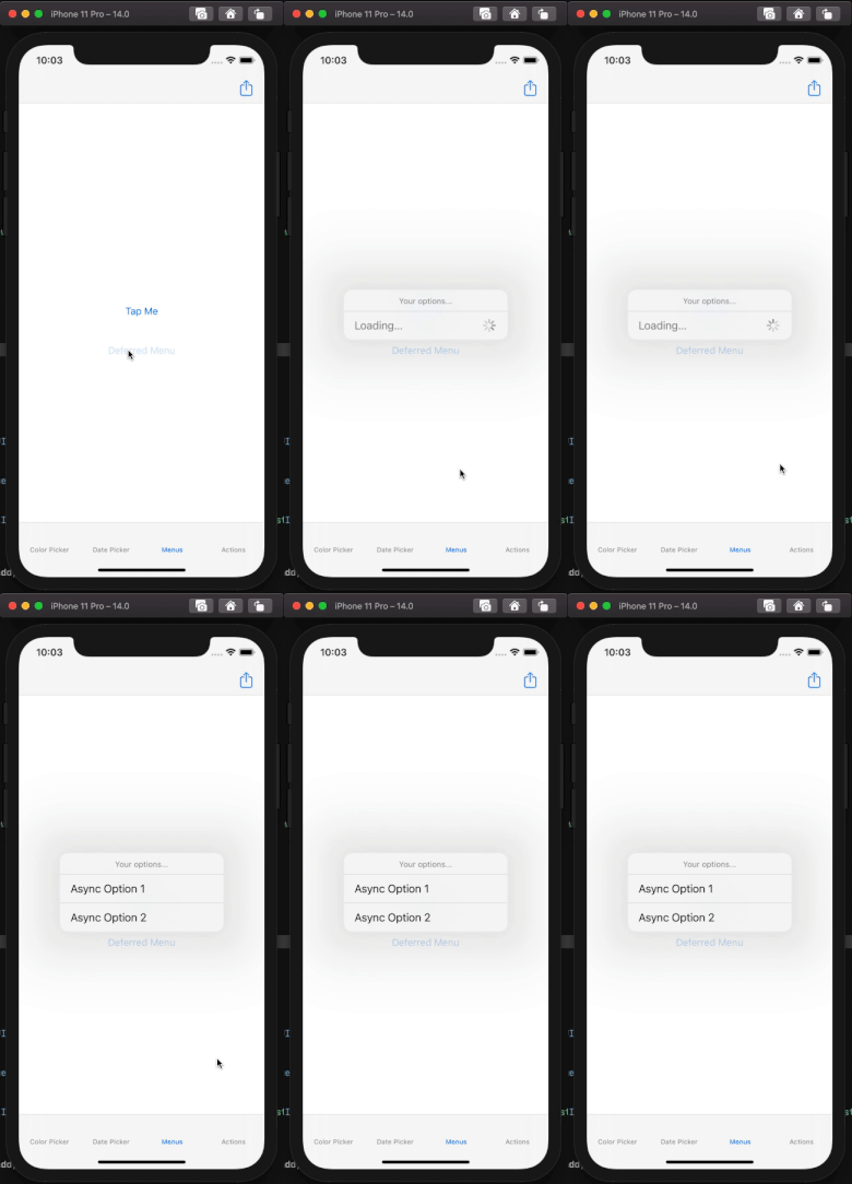
If you tap the button more than once you’ll notice that there’s no more waiting time to show the menu actions; menu is cached.
Dynamic menu items like the example we just implemented can be combined with static menu items (menu actions). To get a taste of that, update the configureDeferredMenu() method so the menu object contains two static actions as well:
func configureDeferredMenu() {
    let deferredMenuElement = UIDeferredMenuElement { (menuElements) in
        ...
    }

    // Add these lines.
    let option1 = UIAction(title: "Option 1") { (action) in
        print("Option 1 was selected")
    }
    let option2 = UIAction(title: "Option 2") { (action) in
        print("Option 2 was selected")
    }

    // Update menu initialization.
    let menu = UIMenu(title: "Your options...", children: [deferredMenuElement, option2, option1])

    ...
}
Here’s what we get this time after running the app:
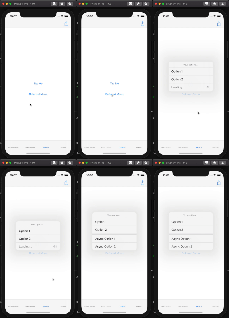
The reason the asynchronously displayed items are shown with the static ones, although there’s a separator between them, is because of the displayInline value we passed earlier in the initialization of the deferredMenu. Try to remove the options parameter value while initializing the deferredMenu object:
let deferredMenu = UIMenu(title: "Additional options...", children: [asyncOption2, asyncOption1])Here’s what you get; a submenu:
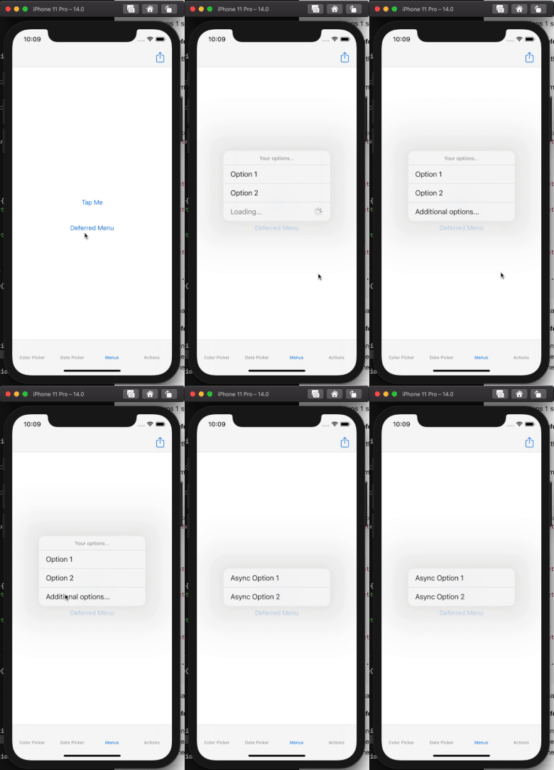
Obviously we don’t need a UIDeferredMenuElement to create menus that will be displayed inline or as submenus to other menus. However, the presentation of the UIDeferredMenuElement has been the opportunity to mention that aspect of menus too.
Performing Actions With UIActions
So far we used UIActions in several occasions in the previous parts of this post, and iOS 14 brings improvements to those too. Besides the multiple references on this tutorial, UIActions have been mostly known from alert controllers and action sheets, as they consist of the only way to assign items and actions to both.
With iOS 14, UIActions come to more controls and therefore they can be used in more places in code; a fact that undoubtedly can reduce implementation time a bit and lead to less cluttered source files.
UIButton With UIAction
One of those controls is the UIButton, which now has a brand new initializer that allows to pass a UIAction as an argument.
Let’s see that in motion, so open the ActionsViewController.swift file in the demo project. Even though some implementation already exists, we’ll create a new method where we’ll initialize a new UIButton:
func createButton() {

}
UIButton has various initializers, but the one that’s new and that we’re going to use is the UIButton(type:primaryAction:). Before we initialize the button, let’s define a UIAction inside the createButton() method:
let action = UIAction(title: "Tap Me") { (action) in
    print("You tapped me!")
}
Now let’s initialize a UIButton:
let button = UIButton(type: .custom, primaryAction: action)The above two initializations can be combined to one only, if we pass the UIAction initialization straight as the value of the second argument in the button’s initializer:
let button = UIButton(type: .custom, primaryAction: UIAction(title: "Tap Me", handler: { (action) in
    print("You tapped me!")
}))
The code snippet we have right above is really important; it’s both the button initialization and its primary action in one place! Before iOS 14, we should assign a target method to be called on every UIButton created programmatically, and we also needed to implement that method separately. For example, a button would have to be initialized like this:
let button = UIButton(type: .custom)
button.addTarget(self, action: #selector(doSomething), for: .touchUpInside)
And the doSomething() method shown in the selector should be implemented separately:
@objc func doSomething() { ... }That’s still possible to do, and it’s also recommended if the action code is too long. However, if the action code is short, then having a UIAction along with the initialization of the UIButton is extremely convenient.
Back to our demo again, let’s specify the button’s color in both normal and highlighted states:
button.setTitleColor(.systemBlue, for: .normal)
button.setTitleColor(.lightGray, for: .highlighted)
Finally let’s create some contraints. This is already implemented, so just call the following method:
createButtonConstraints(button)Here’s the createButton() method in one piece:
func createButton() {
    let button = UIButton(type: .custom, primaryAction: UIAction(title: "Tap Me", handler: { (action) in
        print("You tapped me!")
    }))
    button.setTitleColor(.systemBlue, for: .normal)
    button.setTitleColor(.lightGray, for: .highlighted)

    createButtonConstraints(button)
}
Call it in the viewWillAppear(_:) method, and then run the app to see the button in action (go to the last tab in the demo app):
override func viewWillAppear(_ animated: Bool) {
    ...

    createButton()
}
UISegmentedControl And UIAction
The UISegmentedControl is another control that can now be used with UIActions upon initialization. Similarly to the UIButton, up until iOS 14 an action method should be implemented separately and specified as the selector method to any segmented control that was added to a view programmatically. However things can become simpler in iOS 14.
In the ActionsViewController class we’re going to add another method:
func createSegmentedControl() {

}
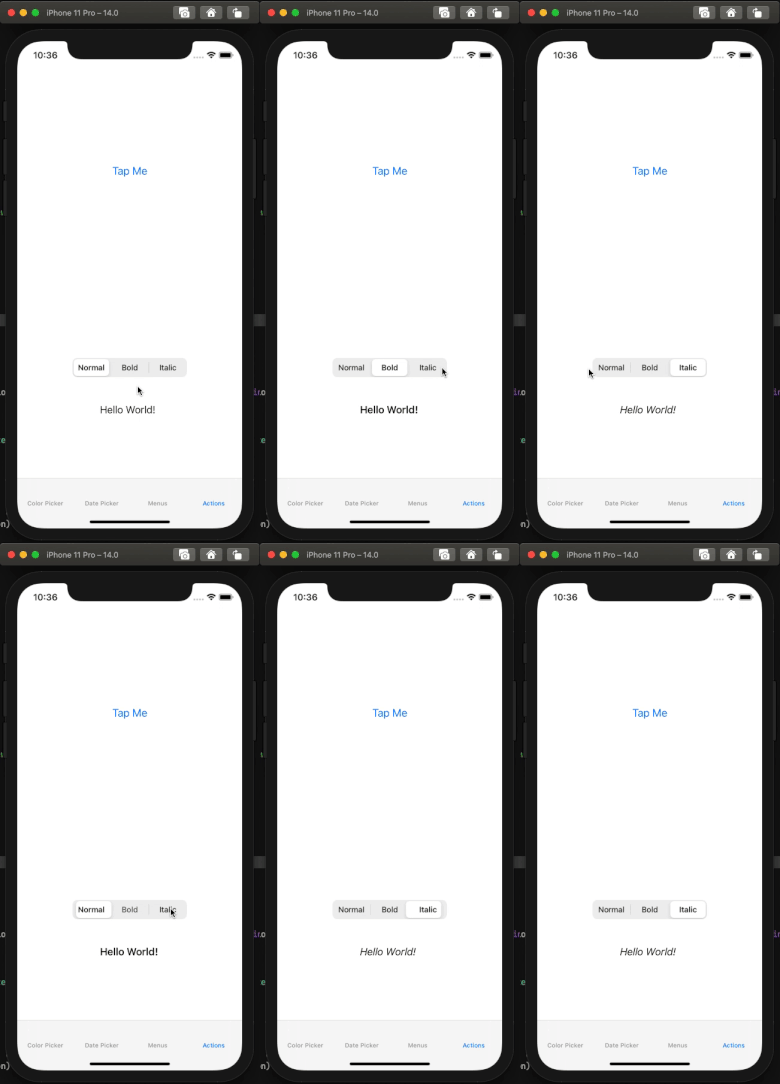
As its name states, we’re going to create a segmented control programmatically. It’s going to have three segments, each one matching to a font style: normal, bold, italic.
These styles are represented in the ActionsViewController class with the FontStyle enum. Depending on the selected segment, the respective font style will apply to a label that already exists implemented in the view controller (but not used yet).
So, here the three actions:
let normal = UIAction(title: FontStyle.Normal.rawValue) { (action) in
    self.label?.font = UIFont.systemFont(ofSize: 17)
}
let bold = UIAction(title: FontStyle.Bold.rawValue) { (action) in
    self.label?.font = UIFont.boldSystemFont(ofSize: 17)
}
let italic = UIAction(title: FontStyle.Italic.rawValue) { (action) in
    self.label?.font = UIFont.italicSystemFont(ofSize: 17)
}
Now, we can initialize a segmented control using the above three actions:
let segmented = UISegmentedControl(frame: .zero, actions: [normal, bold, italic])And that’s it, the actions we just implemented will handle the selections on the control’s segments. There’s no need for any selector methods, or any other additional code regarding the segmented control’s action. However, we can make the above code less as shown next:
let segmented = UISegmentedControl(frame: .zero, actions: FontStyle.allCases.map({ fontStyle in

}))
Instead of passing an array of UIActions, this time we’re iterating through the cases of the FontStyle enum. Using the map higher order function we’re going to create and return a collection of UIActions based on the available font styles.
So, let’s create a new UIAction inside the body of the map function. In its closure we’ll use a switch statement in order to perform the proper actual action depending on the font style:
let segmented = UISegmentedControl(frame: .zero, actions: FontStyle.allCases.map({ fontStyle in

    UIAction(title: fontStyle.rawValue) { (action) in
        switch fontStyle {
            case .Normal: self.label?.font = UIFont.systemFont(ofSize: 17)
            case .Bold: self.label?.font = UIFont.boldSystemFont(ofSize: 17)
            case .Italic: self.label?.font = UIFont.italicSystemFont(ofSize: 17)
        }
    }

}))
The createSegmentedControl() method is almost ready; what is still missing is to specify the index of the default segment, and to set the segmented control’s constraints. Here it is:
func createSegmentedControl() {
    let segmented = UISegmentedControl(frame: .zero, actions: FontStyle.allCases.map({ fontStyle in
        UIAction(title: fontStyle.rawValue) { (action) in
            switch fontStyle {
                case .Normal: self.label?.font = UIFont.systemFont(ofSize: 17)
                case .Bold: self.label?.font = UIFont.boldSystemFont(ofSize: 17)
                case .Italic: self.label?.font = UIFont.italicSystemFont(ofSize: 17)
            }
        }
    }))

    segmented.selectedSegmentIndex = 0
    createSegmentedControlConstraints(segmented)
}
In the viewDidLoad(_:) add the following two lines:
override func viewWillAppear(_ animated: Bool) {
    ...

    createTestLabel()
    createSegmentedControl()
}
Run the app one last time and use the segmented control to change the label’s font style. See that the actions specified through the UIAction objects work properly, with the most important thing being the fact that the control’s initialization and action setting exist in the same place.
More controls, such as the UIBarButtonItem, also support UIActions in order to set their primary actions. The implementation is quite similar to what we just saw on the UIButton and the UISegmentedControl, so I leave it to you to discover how to initialize a UIBarButtonItem with a UIAction as its primary action. Note that it’s possible to initialize a bar button item both with a UIAction and a menu, and that makes it even more interesting to create an app’s UI in code.
Conclusion
Generally, it’s always nice to see Apple maintaining UIKit and making improvements on it, and it couldn’t be otherwise since there are thousands of apps built on it. Until the transition to SwiftUI is done globally, UIKit remains a player in the game and it’s a good thing that it keeps evolving too.
Regarding the features presented in this post, I believe we’ll agree that they’re all quite interesting and useful, with one downside only; they cannot be used in prior iOS versions so we can build apps using the same APIs and the same UI controls. But it’s always been like that, so we’ll adjust.
I hope you enjoyed what you read, and if you liked it please share it! For reference, you can download the complete project here.


